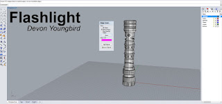
Flashlight Model:
Concept: For the flashlight model I sort of just went with whatever came to mind with the techniques used in the videos. Ultimately, it ended up looking akin to a lightsaber, so I just ran with it. It has a handle where it has gripping for the user, soft cut outs on the side to act as vents, and a red button to turn the flashlight on. The red rings don't play any part in the conceptual design outside of aesthetic appeal. May the force be with you.
Modeling: Techniques Employed to execute your model
My modeling techniques were expanded when completing this flashlight model, because of the introduction of the ability to project curves on meshes, cut it out, and essentially bridge over the edges. I also stuck to the basics to help block out the shape, and the boolean curve technique was pretty amazing. The ability to just alter a curve instead of the entire model greatly helped. Oh, chamfering and filleting also became my best friends.
Materials: How your Material choices reflect the underlying concept
I went pretty standard when it came to choices of the materials for the flashlight, sticking mainly to metals and plastic rings/gripping. The light bulb inside has a glass material in order to refract light and give off the idea of a bulb. The red is a soft plastic red and catches some nice highlights from the lighting. The metal material looks like it gives a weather-worn effect on certain edges- which i thought looked really nice.
Duck Model:
Concept: This model was pretty much inspired by the simple idea of a fancy duck. Basic and simple. I gave the duck model a top hat and kept the overall execution simple and close to the tutorial. I had a difficult time coming up with an idea of a different duck. Hence, the lack of originality. The top hat is nice though.
Modeling: To accomplish the look of this model I used curve projections and point-control to move the mesh into the shape of a duck. I used a projected curve to cut out the beak shape from the mesh of a sphere. The top hat is basically a cylinder with a hollow inside. I also gave the duck some simple eyes using curve cut outs. The projection of an edge to cut out a shape was super helpful.
Materials: The materials of the duck are meant to compliment the theme of the duck- fancy. The titanium diamond shapes made me think regal and contrasted nicely with the golden metal of the beak. The top hat is a leather material slightly altered in order to bring down the specularity of the original shader. The eyes hold different matte plastics. This has become one fancy duck.


No comments:
Post a Comment