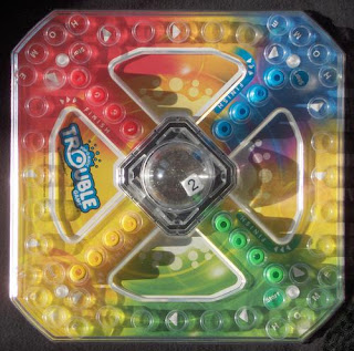
Concept: My theme for this semester for this class is going to be board games and so I based my castle on the board game Trouble. This was a game I played throughout my childhood and I remember it being one of my most favorite games in the world. For those who are unfamiliar with the game, it is basically like sorry, but you have a dice instead of cards.
Ghosted Painted Black (Above)
Keyshot Layers (Below)
Modeling Techniques:
The techniques that I used ofter was copy and paste since I wanted to keep the same shape a continuous factor throughout the entire creation. I also used arrayPolar for the center set of arcs and for the four sets of four cylinders on each corner of the larger base. I also used BooleanUnion for the joining of colored pillars and spires so that I could make it one piece rather than several pieces. It also made it easier for layer assignment when it came to creating the layers.
Keyshot Far View (Above)
Keyshot Pedestrian View (Below)
Material Choices:
I mainly stuck with glasses and because I wanted the inner designs to shine through. I also color coded the outer spires with red, green, yellow and blue to indicate the colors of the board as if it was the actual game board itself. I used a clear glass for the center to indicate the popper that is usually in the middle and colored the "dice" in the middle with a ceramic I believe to color it as if it was dice. Then I used a metal material for the basses of the middle and the bigger base because I really liked the way it reflected the colors and it also gave it a sense that there was another side to the castle then what you see.


No comments:
Post a Comment