Project 1: Castle
My inspo:
My inspiration for my castle was this model, this heavily influenced the shape of my model as I structured my model in the same shape. I implemented the same tower shape keeping it the ends sharp giving it a more gothic look. I also implemented the gears and gave it my own twist, I chose this particular image for my inspiration because I wanted my castle to look gothic, mechanical and rustic implementing rocks, metals and woods.
 |
| Inspiration picture |
Process
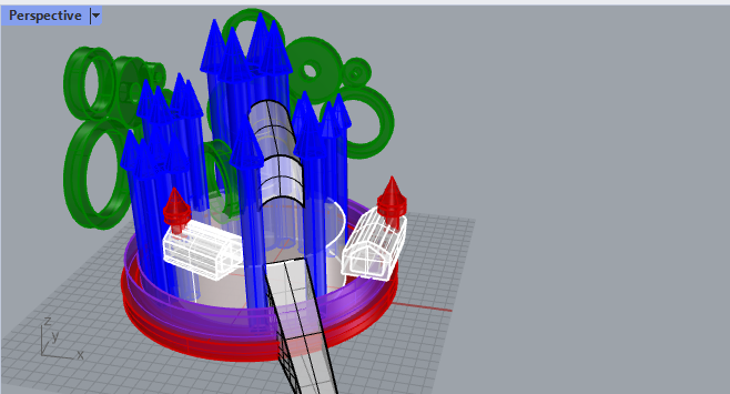
My Process Involved the commands like creating a circle with the circle command and then using the extrudecrv command to extrude it into an 3d object. I also used a lot of cap planar holes command. I also turned on the control points and selected the vertices and extruded by using the move command. I also used the copy command to duplicate my towers, when modeling you want to be efficient of course. I also used the join command so when I moved or selected a group of items they would all move together and would make the work a lot easier.
 |
| Working Process |
 |
| Layers |
 |
| Ghosted |
Materials
For the materials I wanted to use rocks, metals and woods. I really enjoy the combo of those materials together. I wanted my castle to be dark as well but to also be seen so I used darker browns and some light stone rather than it being all black like I would have preferred it to be.
 |
| Top View |
For the top view I used an all white background so you could be able to see the model more clearly and lit up.
 |
| Perspective View |
In the perspective view I used a darker but still light at the ground background so it can really stand out but still have the overall dark theme. I chose to angle the shot this way because you are able to see the "gear" in the middle of the castle which otherwise would be hidden if it was displayed like the front view.
 |
| Front View |
For the front view it was more of a side view but I just used to automatic front view that keyshot gives. I feel this angle shows the textures and and materials the best. I also decided to go a little darker for this shot just to fit my theme.


No comments:
Post a Comment