Sunday, January 22, 2017

Rebecca Genung: Week 1 Duck


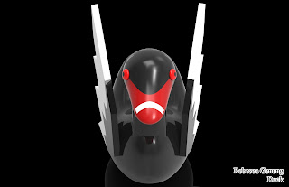
I've always liked the dual imagery of a black swan and a trumpeter/mute swan so I suppose I can say that black swans are my favorite waterfowl (Is that a thing? Do people have favorite waterfowl?). I also thought back to glass statues I've seen in shelves. Normally a swan is either in the heart-neck shape expressed by the birds in real life or they have their wings partially visible. I wanted to emulate the latter. I also find black swans themselves to be very beautiful and underrated.
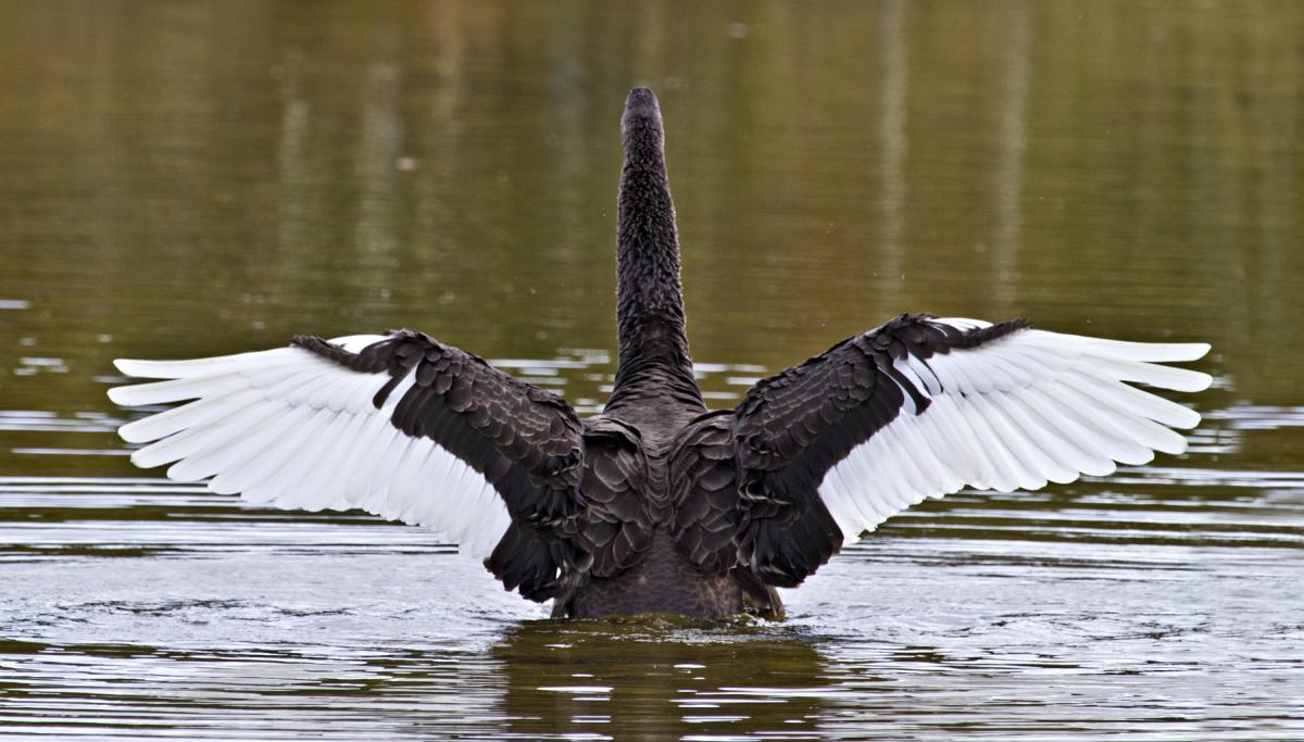
I'm afraid my model is rather derpy in comparison to the real thing...

I immediately wanted to make a swan rather than a duck and planned accordingly. I made the beak thinner and the neck longer.  I was thinking trumpeter swan at first because their beaks are only one color, but when the tutorial talked about cutting the model and splitting the shapes to have multiple colors I thought about using a swan with more than one color on their beak. I then thought about how black swans have two colors on their wings as well and decided to add wings to the model via drawing them out, extruding, and cutting the two colors. The beak color is also done through cutting.

For materials, I used paint gloss and colored it accordingly. The red of the eye is a slightly lighter color than the red beak. I was thinking about colored porcelain at the time, but I didn't like KeyShot's porcelain texture as much as the paint.

Simon Fields: Week 1 Ducky


Ghosted

View 1

View 2

View 3
For my design I ended up straying away from actually making a rubber ducky and made a fat little fairy sitting on bubbles. Along with my castle I really like cute and creepy things so I wanted to make something that looked adorable but uncomfortable to look at! This also reminds me of something that could come from the show Adventure Time. 

In Rhino I mainly relied on spheres, curves, and point controls. I manipulated the spheres to create the main body. For the limbs, horns, and wings I used the curves to created the shape of them, and then I manipulated the spheres I used into the shape i drew out with the curves. For some reason there was only one naked edge between the head and neck. I tried to fix it by redoing the Blend Surface function again but it only was able to connect the neck to the body when I tried to rejoin the pieces again. It was time consuming but it still came out the way I wanted it to!

I wanted the fat little fairy to look like a toy or a cartoon character, so I used mostly Matte materials with the exception of the horns, wings, and bubbles. I selected bright colors so that he has a brighter feel to him. I used a bright setup so that it feels more friendly and more cute to look at even though he is a weird one. 

Simon Fields: Week 1 Castle


Ghosted 

View 1

View 2

View 3

For my design for my castle I decided to go for a snow globe type look! I really like a lot of things that are cute and creepy so I wanted to keep the theme at that. I also like drawings and gifs that have the illusion of infinity, so I decided to make the snow globe seem like it was going on forever on the inside of the dome.

I used a lot of solids and curves for this piece. I used the curves to create weird shapes that wasn't already built in Rhino. I also made use of polar arrays and arrays along the curves I made for the spiked fence on the inside dome. I could not really think of a way to make the dome itself without having a naked edge but I feel that it worked in this case for my castle.

For the materials I used in Keyshot I wanted to give it sort of an industrial look so i used mostly metallic and shiny materials. I wanted to a have an accented monochromatic color scheme so I limited the colors I used to gray scale and reds. I wanted to show a bit of an eerie feel so I made sure not to make the lighting too bright in the renders.


Saturday, January 21, 2017

Jason Doze: Week1 Duck

 Ghosted

 
 Camera 1

 Camera 2

Jason Doze: Week1 Castle

Ghosted


Birds Eye


Pedestrian


 Concept:  My concept was to design a vertical castle with long spires with a clean, polished look and tons of reflection....something otherworldly .  As I was learning how to model in Rhino and use the shaders in Keyshot, my design shifted a few times as I went back to Rhino to make adjustments, move, and add structures.  I started with a reference photo, but quickly left the style behind.


Technique:  I used alt + drag many times, as well as ArrayPolar, ArrayLinear, and Rotate.  I had many happy accidents just playing around and trying to navigate Rhino.  There is a lot to take in with this software and most of the tutorials I have found are PC based, so following along on my mac is alot of fun. 😜  I'm doing a 10 day trial on Lynda.com and watching as much as I can in the trial period which is only 10 days.  Rhino however has a 90 trial which is much better.

Materials:  For the castle project, I used spheres, pentagons, cones, cylinders and the torus.  I played with many of the shaders, but eventually settled on marble granite, brass, chrome, glass, gold, nickel, and plastic.  I think knowing the availability of the materials will help in designing other projects with more foresight. 

Wednesday, January 18, 2017

Michelle Ignacz: Week 01 Castle

Overall View


Pedestrian View

Bird's Eye View

Normal View

Ghosted View

No Naked Edges

Castle Model Layers


When creating my piece I had started off with a basic idea of just placing towers onto the base and then trying to continue up from the bottom. As I continued to work, I began to think of a type of Utopian society that has a dark, industrial underbelly. Running off of the designs of a movie called Castle in the Sky I ran with the idea of a shiny organic exterior with a smokey and dirty underbelly as I went along. From here, I imagined a bright fruitful garden bursting with life; but as we flip the city, we are greeted with pollution and smog.

For the design I went with circular organic shapes for the upper levels, creating types of archways and doors that seem like life can wrap itself around it. On the underbelly I incorporated more strong edges and unnatural pipes that run out of the bottom to portray smokestacks and machine designs.

When applying the materials to the "castle" I applied a granite grey for all base platforms of the building landscapes, glass refractive grey walkways, blue gem stone columns, blue chrome for the perimeter around the main base, anodized brushed gray to the posts on main base, brick towers, glass to the surrounding icicles dangling from the base, and anodized rough black to the smokestacks. I tried to keep the idea of a pristine top-side with a filthy underbelly underneath.

Sunday, January 15, 2017

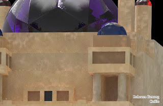
Rebecca Genung: Week 1 Castle

I'm sorry if I did this wrong and/or posted in the wrong place.

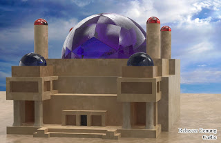
This is my castle:


I was inspired by the Dinotopia books. The architecture in the books is a mix between various cultures but presented in a unique way. Most of the buildings look like they're from a particular place or time but when you compare them side-by-side with a real building, they don't entirely match up culturally. I wanted to create something with both Babylonian and Arabian inspired elements but was distinctively neither.
I'm new to Rhino so it is rather basic modeling-wise. As someone used to Maya and ZBrush, I got frustrated a few times. I prefer organic modeling. Architecture is not my strong suit.
I wanted to go sandstone bricks on the materials, but I used the next best thing. If I put this in Unity or assembled it in real-life I would add signposts and banners in Dinotopian footprint script and such, or alternatively, a line of criosphinx statues to make it more culturally ambiguous.

A NOTE TO ANYONE GETTING KEYSHOT DEMO FOR HOME USE: Even though it says that the watermark will be removed, it is still there at rendering. Do not get the demo.