Monday, November 1, 2021

Kyle Kapischke Project 3 - Makerspace Lamp

 My inspiration for this project was my brother telling me to do something from our ancestral heritage, which is pretty eastern European. I think I'm 25% percent Swedish or something. My funky last name is Polish for "Cabbage farmer," so there's that. So, I thought I'd do a mishmash of all that junk. I'm really into ancient history, and really like old Anglo Saxon and Nordic art, what little exists of it. I thought it would be kind of cool to do a lamp / lightbox that tells something of a story, like how old art like the Bayeux Tapestry did. Since there were only four sides, I thought I could do something like a Life-to-Death kind of story.


My design was pretty simple, it depicts a young man leaving his home for the first time, him becoming a man and going to war, him as an old man returning home, and then finally, him passing away and being laid to rest in his tomb. I wanted it to look like he was traveling to the end, "from the womb to the tomb" as Joseph Campbell said in his book "The Hero with a Thousand Faces."


Transferring to Rhino was very easy. All I had to do was take my Raster drawings and wrestle with Illustrator until I had a nice Vector of the lineart. After that, I just had to import to Rhino.


Very, very simple. It came out better than I had hoped. There was minimal touching-up to do. 


Creating the 3D model was a bit more tricky, however. It took a lot of fighting to get everything just right. There was a lot of Boolean Difference-ing, and I really struggled getting it to Extrude properly. I'd chalk that up to the design having too many details, I don't think Rhino appreciated it. However, the final product came out A-Okay, and then it was onto the renders.


I thought it'd be cool to cut out the sky for the light to get through, as well as their pupils. To keep with that nordic theming, I'm going for a dark brown stain, with the landscapes stained or rastered darker. I found a cool LED lightbulb at Home Depot which emulates a warm vintage look, and I'm hoping it'll look like candlelight, hopefully making this appear older.


Jessica Munoz - Lamp


       Jessica Munoz 


So I wanted to do something simple and I didn't want to go all dramatic on the design for this lamp but in my model, I used color combinations that we were using for the layers to make sure I know which is the vector and which one is the Engraving so where I won't be confused. Also for my lamp, I was going to use the light bulb but I decided to use LED lights starter easy and remote control so battery-powered or they don't pull off too much heat. I made sire that that was not copping soemle so did do my reher.

Conctes
Some of the things that I'm wanted to do was to make sure that everything was the okay size it golds I did have a hard time doing all of the layers because I had to figure out which is which but in conclusion that to make sure that everything was equaled and nothing was like imperfect. another thing is that I wanted to give an idea of exactly how we're going to put the LED light so I had to make sure to measure and to make sure that the LEDs work and where there was a way I didn't have to make a component to put the batteries in so I figure out an easy way out. to that easy way was getting LED lights that are able to give you to just needs batteries in the end of time where they're controlled power so it can fit perfectly and they're very small and not that big I was able to measure for the examples that professor. 


Techniques
 Some of the techniques are used for Engraving factoring especially for the 3D model but I do not have a preview Moto yet finished so by the time you're reading this im doing it. That Techniques that I used to make sure I put the vector and the Engraving I don't have any rosters but in the near future maybe I might change the design of the Ross maybe add some rosters but I have not decided on that but I do know it is part of the project that needs that. for the 2D design using the techniques or easy using the line tool is the shift most easiest thing to do on right now easy techniques especially copying the design I have but I also made sure to measure my designs. Ther was that was swothng that all we need was wothng give was swothng that all we need was wothng that we need that was something that all we need was swothing give was swothng .


Miko Aguon: MakerCase Lamp - Week 10

Concept and Inspiration

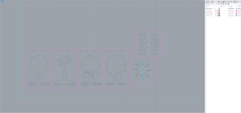
The original idea was to make a dog box. Then it went to Shiba Inu to a Japanese box. Then, to cherry blossoms and finally trees. The Cherry blossoms stayed because of the pink and beautiful colors, the Ginkgo tree (the yellow one) was actually the first time I've seen a yellow tree online and it is really pretty. Like a Sakura tree... just yellow. The palm tree is chosen because I'm an islander and Guam is my homeland. Simple as that. I finally chose the willow tree because it looks very different and unique compared to trees like oak, birch, evergreens, etc. In my opinion, those trees look very similar and I don't like them. The willow tree, however, makes a tree look like it has hair and that's pretty funny to me but it does look really good and I like it. The four seasons image is to show the difference in colors of trees and leaves- not seasons and weather. Solely color and style.


Modeling Process - The Images

While I didn't have to make the MakerCase model myself, I still had to somehow translate my physical drawings physically. I spent a bit drawing up the flat drawings into photoshop. Pretty simple stuff. The hard part was getting the drawings into the 3D model itself. I was going to need to extrude it and have it boolean difference to cut out the box. At first, I tried importing the image itself and extruding it but it ended up just making a square with the drawing in it. I tried giving the images a transparent background and started to convert. It was one step closer but not enough. I then tried making the file into an image file specific for 3D modeling but the files I converted the images to were outdated and did not work in Rhino anymore. I tried to do a PDF but all that came up for me was a black square (this was apparently supposed to happen as you are supposed to delete the black part of the PDF image and you will get your image, but I did not notice). Finally, after spending hours trying to figure out what image file worked and didn't work, I ended up converting my PNG/JPEG files to Adobe Illustrate files using an online converter. I was able to extrude and boolean the difference in the images from the box and was very satisfied with the result. I didn't need to extrude the bottom (the moon) as I didn't actually need the image to boolean a cylinder when I could've just made one in Rhino. 
Modeling Process - Putting It Together

I did my best to align the box but for whatever reason, it wouldn't align perfectly. I don't know if that's how it's supposed to be and whatnot but I hated it. I tried using the Move Tool (which was the best method), I tried manually moving it and entering values with Gumball (takes a long time for "accuracy"). Eventually, I ended up giving up and just shoved everything together as best I could while still making it look nice. 


Modeling Process - Filling and Coloring

I ended up doing the coloring and fill-in the hard way. I made flat squares and just adjusted their size according to how I needed them. I had at least 1 part for wood, at least 1 part for leaves, and one ground. While everything in the lamp is cut, the only exception is the rastor engraving for the falling leaves of the Sakura tree. The sun (top of the lamp) was the easiest part as I didn't need to make multiple layers for it. In the end product, I might end up not having a paper covering for it at all because of heating issues. 


Rendering Process

For rendering, I couldn't just have all the leaves, branches, and grounds the same layer as it would change the material for all of those pieces, so I made individual layers (the "TEST" layers) and marked them specifically for rendering and applied the materials. Speaking of materials, I needed a material that let light pass through it. Glass was too transparent though, even if it was colored so I ended up looking through the "Translucent" materials. Human Skin was translucent and pretty good but I didn't want to use it because... it was skin for one, and two, it had a red tint to it too. I chose the other option available with the name "Translucent 100mm". It was one solid color that I could change and allowed light to pass through as well. I changed the color of the material and changed the translucency to 3 inches as opposed to the starting value of the material. 


Finalized Pictures


Sarah Cepeda Project 3 - Makercase Lamp

So, actually, I scrapped my original lamp concept. I decided to go for a much more open design so that I could have more light and make more use of the "lamp" aspect. I decided to go for a wide white stroke concept, essentially working in negative space. 
I started by finding some flowers that had some well developed lines within them. I settled on roses, plumerias, daisies, and calla lilies. 


After settling on some good reference images, I drew up some graphics, took pictures of them and converted them into svgs using adobe capture which did most of the work of converting them into black and white along with some clean-up. Fortunately, adobe capture scans and creates compound shapes which meant I could then release the shapes and end up with the negative space images you see below by deleting the strokes. I fixed any issues in Illustrator before importing the file into Rhino.


Unfortunately for me, at some point I completely forgot I was supposed to do the stems as vector engravings and I made them all as hatches... I did not realize this mistake until I was importing into Lightburn to use the machine at the Maker Space, however, so I improvised a font name for each of the flowers on the lamps as it was 2 AM the night before I had to leave for the holidays and my only change to print. As a result, you may (or may not) notice a slight change in the design between this one and the final product. 


For the 3D model, after importing from Illustrator I simply made planar curves of the outer cuts, extruded them .25" down, extruded curves on the inner cuts 1" both directions and boolean differenced them. For the raster, I exploded it, took the resulting planar curve and extruded it down .125" before boolean differencing it as well. 


For the final render, I used a Varathane Premium Kona Brown Wood Stain that falsely advertised "color in 1 coat" as well as "dries in 1 hour". It has been 3 days since the initial coat and we're still sticky to the touch and staining everything from hands to paper to tables. I did like the concentration of the stain in that a little did go a much longer way, but I erred in that I chose the cheapest brush and it just so happened to be barely able to fit into the can which made life a little harder. 


It is difficult to make out in the lit images, but there are the names of the flowers underneath them in vector engravings as evidenced by the final picture. I intended to paint them another color or mask them, but they were so small of letters and the paint refused so adamantly to dry that I could never get around to it. Additionally, the negative space created a nice puppet show effect that I think in the future I would like to capitalize more on.