Travis Briney: Week 1 Castle
Concept
Techniques
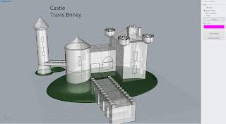
Although there were separate parts, each area had a unique style and needed a different way of constructing. I started with the bridge that led into the ground initially. I made a rectangular prism first and then made intersecting cylindrical-like objects. I would then array them across the side of the prism and boolean difference the area and delete the second input. I did that same concept with the little ridges along the bridge in front and back; with those I used rectangular prisms that intersected through a raised edge. With the buildings itself, I would just start with a rectangular prism and then make a slightly smaller one and boolean difference the inside so it would make a hollowed out area. I then subtracted rectangular prisms out of the sides of the building and replaced them with another one of the same dimensions. This way I could separate glass from wall textures and materials. Lastly, I would fillet the edges of some hard corners so there would be no naked edges.
Materials
When I went into using materials, it took a bit to figure out specifically what would do the reference images justice. I accepted that I wouldn't be able to replicate it as well as I'd hoped, so I settled on using reasonable materials that would make sense and look decent together. The door on the front and back both use a mahogany wood that looks slightly older and not eye-popping. Since a lot of the castles I looked at were built a long time ago when materials didn't vary as much, I figured it would make sense to see the buildings and bridges made with the same stone texture. It doesn't look exactly like I would hope, but I just didn't find a stone brick texture I was satisfied with. Lastly, the roofs use a brownish-orange mold texture.


No comments:
Post a Comment