Showing posts with label corrinaspurlin. Show all posts

Monday, December 5, 2016

Corrina Spurlin: 3D Scanned Object

Concept Image

Prototype

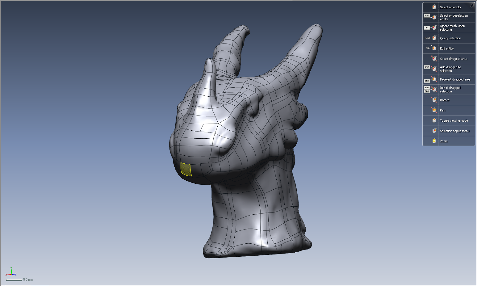
Rhino import


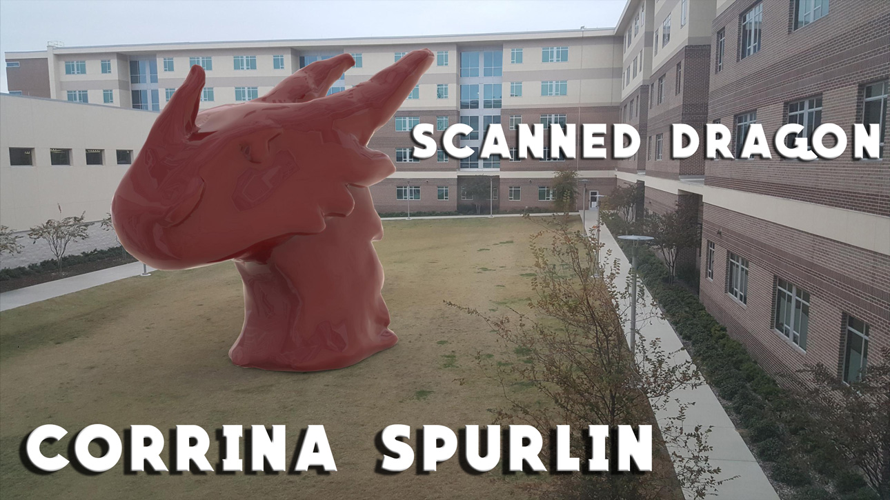
Final Keyshot


Concept:
I worked on this project in collaboration with Sarah Roberson, with the same object. The object was based of the drawing, which is a representation of Starscream from Transformers. 

Techniques:
The main technique I applied was specific editing for the Keyshot visual. I adjusted the lighting and imaging so that the final model reflected what was around while matching the scenery. The image used is of an open field behind Residence Hall West. 

Materials:
The material used to create the object was clay. It was sculpted then set. Materials from Keyshot were applied to change the object's look.

Saturday, December 3, 2016

Corrina Spurlin: Box Project


Concept:
I aimed to keep my theme of flower design going, as it is simple yet complicated, which I appreciate. I combined the flowery look with the symmetrical aesthetic of mandala (as can be seen by the design on the inside bottom of the box). All of the designs used on the box were originally created in Adobe Illustrator.

Techniques:
The main tools I used were in Illustrator. I utilized the shape and pens tools, while creating the symmetrical repeating patterns with the radial tool. I also used the halftone effect to give the raster engraved flowers on two of the sides a hatched look.

Materials:
I was originally going to use wood I purchased, but due to type of wood combined with sizing complications, I was unable to do so. As substitute I used cardboard. The cardboard is fairly sturdy and works well for the elements that were cut through, however, on the designs that are raster engraved it can be a little difficult to see.

Tuesday, November 1, 2016

Corrina Spurlin: Week 11 Skateboard Engraving

Illustrator Design

Engraved Board
Close-Up of Engraving
Attempt with graphite


Concept
The concept for my skateboard design largely played off of the visuals that came from my 3D Printed Model. I wanted to continue the rose-like theme, while upholding a rigid and geometric aspect to it as well. I wanted to contrast from my 3D model, however, in that the design would appear generally intricate and compact, instead of simple and open. 

Technique
The main techniques utilized in this assignment were the line tool and pathfinder in Illustrator. I also used the rotate tool to create the radial flower designs that sit between the diamonds. Pathfinder was used to crop an inverted version of that design so that it could appear again, just in a different form. 

The file was setup to match the board as closely and accurately as I believed possible, but when it came time to engrave, problems arose and the engraving ended up being off-centered on both axes. 

Materials
The materials used within this project were the skateboard deck, and use of the program Adobe Illustrator. 

The material of the board created an issue for me when it came time to actually engrave, as it had an outer non-wood protective layer that caused the engraving to look different than I would have preferred. The laser had to do more work to get through to the wood, so when it did it was weaker and didn't appear dark. I plan to engrave my design again in the future with a board that either does not have a protective layer, or one that will be easy to sand down off the wood. That way the final product will look much darker (and as close to black as possible without any of the design).

It was recommended to me that graphite or charcoal could be used to fill in the design to make it appear darker, so I tried to mark graphite onto one of the small diamonds to test this theory. As it can be seen in the final picture in the series, this caused the raised layer to look darkened, after wiping off excess, instead of the engraved level. 

EDIT:
I attempted to re-engrave my design with a slightly different material wood that I additionally sanded prior to the laser engraving. The result was far better than my first attempt. 


Monday, September 12, 2016

Corrina Spurlin: Week 2 Duck

Ghosted painted black

Ghosted with Keyshot assignments


Concept
The main idea I had when creating this duck was that it would be some form of minimalistic. By forming the body and other parts into simple shapes, or with simple geometry, this was achieved. I also kept this idea throughout the whole composition by reducing the amount of parts that would need to be created. Parts that already seemed connected were combined to continue this theme. I also attempted to make the duck have a more stylized and cute look rather than being realistic. 

Modeling Techniques
The main modeling techniques I used when creating this duck were varying commands relating to the surfaces of the objects. For example, I used commands to orient an object onto the surface of another one. I also used the command Rebuild in order to create the simplistic look. F10 was used in order adjust the shapes of some of the objects. 

Materials
The materials I used for my duck were chosen around the idea of simplicity. I almost used materials that appeared to be toon-like but they lacked depth and seemed too fake. Instead, I ended up using smooth materials that would work well in showing the shapes and edges of the design. The colors I used with the materials followed the general idea of a standard rubber duck but included underlying tones of colors from other objects. For example, the red objects would have underlying tones of yellow and vice versa. 

Corrina Spurlin: Week 1 Castle

Ghosted painted black

Ghosted with Keyshot assignments


Concept
The main idea for this castle was based on how churches often look. A reference image wasn't used as I wanted the idea to be original and see how it turned out. To achieve the theme I included repeating archways with an ascending design. I kept the design more simple than complex because I wanted to combat the standard of how intricate some churches can be. The colors involved were used to also counter how natural-toned churches are. The church idea for the castle was meshed with the idea of making it look mildly human, which was accomplished by putting a sphere on top to represent a head.

Modeling Techniques
The main techniques I used when creating this castle were MakeHole, rotate, and scale. Translation was also involved whenever I changed the location of something as I wanted the design to be different. The MakeHole command was used in varying ways, as I sometimes used it to cut all the way through an object and other times only to cut into it part way. Rotate was used often in order to create the repeating patterns around the structure evenly. Scale was used to copy objects and put them in another part of the work, such as the rings, to make the piece balanced. 

Materials
I wanted to use materials that would allow for a general stylized feel, in order to continue the idea of having a non-traditional church-like structure. To accomplish this I only used smooth / sleek materials. The material used throughout has a metal-like texture to it, allowing for underlying tones that can be intriguing to look at. I used contrasting colors to continue the idea of having something different from a church, which typically can be monotone.