Concept and Inspiration
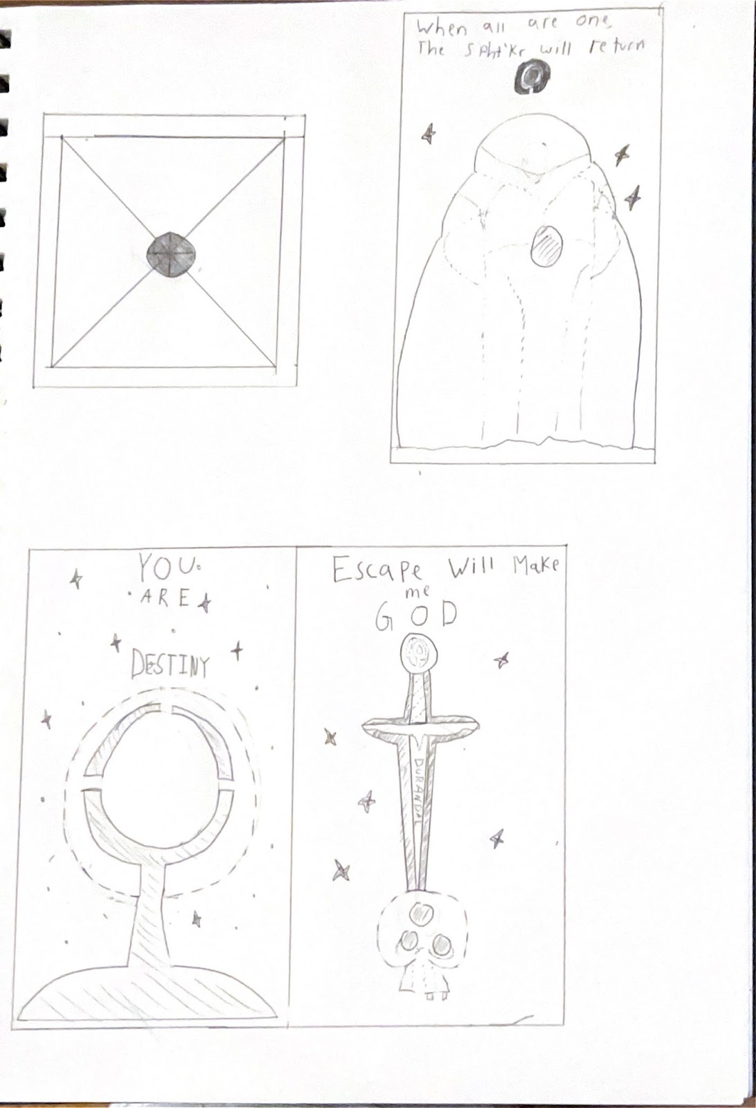
My inspiration for this lamp comes from an old video game called Marathon. Developed by Bungie, the same studio that made Halo and Destiny, Marathon is a classic 90's shooter that fell heavily under the radar due to the game only being available on Mac. I wanted a Marathon-themed lamp, with each side being some sort of reference to the game.
Process
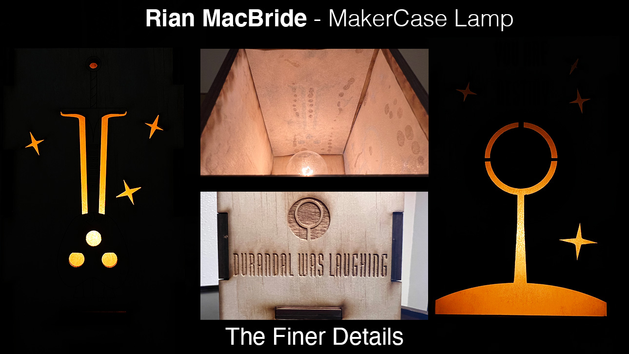
This project was my excuse to get good with the pen and various line tools and commands. The Marathon logo, a big magnifying glass-esque symbol, is prevalent throughout the game so I incorporated it on multiple sides. A variety of quotes from the game are on the sides of the lamp as well. I tried to make the Marathon logo on the lightsaber project but struggled with it. Apparently, I was extremely overcomplicating it, because this time went swimmingly. I made a couple of circles and a variety of straight lines, then used the split and trim tools to finish the design. The text was a big part of this design and I really did not want to settle for a bad look. The main title of the Marathon games uses a specific font, Modula Roundsans. After a quick google search on the Bungie forums, I found this out, and after some more google searching, I found a download for this font for free. It is extremely easy to upload new fonts to Rhino. It uses the base fonts already installed on the computer, so all I had to do was install this new font onto my machine. Drawing the skull and sword was extremely fun, and thinking ahead about how it was going to be cut was a challenge. I had to think about where and how all the cutouts would be attached, and make support structures to compensate. The 3D model was also fun to make. I extruded the line drawings and pushed them just barely above the surface so they would show up in the Keyshot renderings. I also added a light cord out of a line drawing and the pipe shape builder, as well as a bulb using a simple cylinder and elongated sphere shape. Finally, on the inside of three of the sides, I made a super thin wall so I could diffuse the light later.
Materials
For the main surface of the lamp, I used an oak wood material. This was closest to the actual wood I ended up using for the final cut. On the inside walls of the lamp, there is an acrylic material to diffuse the light source. I put a grainy concrete texture on the acrylic to roughen it up and actually diffuse better. One of the sides I made green to have a little green light poke through, though this didn't end up happening on the final product, nor did it even really read in the renderings. For the lightbulb, I put on an emissive glow. I kept it white as I was unsure of the final light color that I would end up using for the final product. I wish I would have made the environment darker to better show off the glow of the lamp. That was a significant oversight on my part, though I think the light shines through well enough.
Final Lamp
The material for this lamp was a sheet of birch plywood I got at Ace Hardware. I also picked up some Loctite superglue gel that cures very quickly. I got this all cut at the North Lab here on campus. I wasn't super sure what to use for diffusion material, so I did a little research. My first thought was to take an orbital sander to some thin sheets of acrylic, but my usual shop for doing that kind of work wasn't available to me at the time. Someone suggested using vellum paper, but I was unable to find any at the store. What I did find however was a book of tracing paper for 5 bucks. This worked out extremely well, as it was easy to work with and glue in place, but provides a really nice diffusion of the inside light. I used the light kit that was recommended on eLearning, and after it arrived I realized I already had a bunch of bulbs that fit the socket. The laser cuts turned out WAY better than I had originally anticipated. The lines are way cleaner than I thought, and had I the time or the resources to sand it down to get rid of the burn marks, plus add a little wood finish, the lamp would look even more beautiful. I love the way the light shines through the various openings I made, and overall I am very happy with how the lamp turned out.


No comments:
Post a Comment