Concept/Inspiration
My lamp was inspired by whimsical forest scenery and floral designs. I also drew inspiration from paper cut art and how shapes interact with negative space. I implemented these ideas into my design when I was thinking about how the light would shine through the cut-out areas and how it would communicate my forest designs. Each of the sides of my lamp depict differing perspectives and compositions of flowers, leaves, and other aspects of forests.
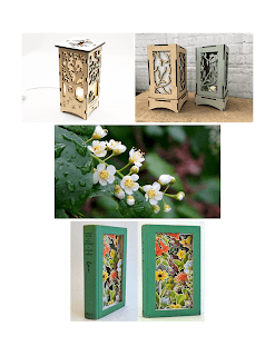 |
research/reference
|
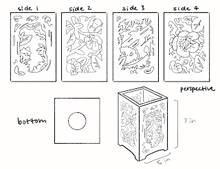 |
orthographic sketch
|
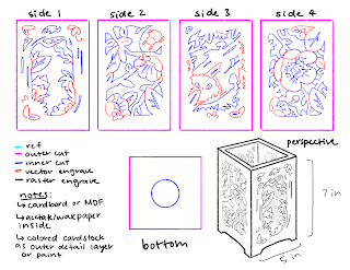 |
blueprint sketch
|
Process
While creating my design, I made sure
to also think about how lines would work together and what types of cuts
or engravings would best depict the foliage design I had in mind. I chose to use inner cuts to represent
negative space and the areas around the foliage in order to depict a
forest full of various plants and little creatures.
In Rhino, I imported the lamp box from Makercase and then began tracing my sketch using Handle Curves. After tracing the different cut and engraving lines, I used Join to join certain curves and then used Hatch to create the spaces that would be rastor engraved. For my 3D model, I extruded the surface using ExtrudeCrv and then assembled the sides and light bulb together. For the wire, I drew a curve and then used a Flat Cap Pipe to create a wire shape. I used PlanarSrf to create the rastor engravings for rendering and for the vector engravings, I extruded the curves out slightly.
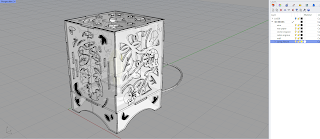 |
3D model layers
|
 |
3D model edges
|
 |
3D model orthographic
|
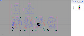 |
laser cut
|
Materials
I used Fine Grain Wood for the lamp wood and the rastor engravings. I adjusted the color of the material to make it darker and made the rastor areas a darker, cooler brown similar to the MDF I used to cut my actual lamp. For the wax paper lining in my lamp I used the Glass Heavy Frost material and adjusted the roughness to make it slightly smoother. Other than changing the color to black, I left the wire and vector engraving material as it was. For the light, I turned the light bulb into an Area Light and adjusted the warmth to mimic how the light would show in the final lamp. I chose a desk for my environment because it would best fit where I would put the lamp in real life. I left the environment lighting simple by putting a light above each side of the lamp to light up the outside of the lamp.
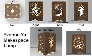 |
keyshot orthographic
|
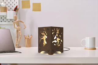 |
keyshot environment
|
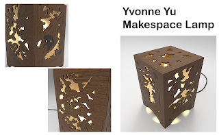 |
keyshot close ups
|
Materials: Post Process
My lamp was cut from a 1/8th sheet of MDF hardboard that I had split with a classmate. While I like the color of the natural MDF, the material was much harder to cut through than expected. I spent a lot of time in the Makerspace messing around with the Glowforge settings and dealing with over heating due to all the detail in my design. My
first try had cut relatively well, but the measurements had gotten messed up when putting the files into the Glowforge software.
I ended up sizing my lamp down to 4x6in to fit onto one sheet of MDF which may have led to
greater difficulty getting the details to cut. It took roughly around 4-5 passes, but even then I ended up having to punch out many of the small details that did not cut cleanly through. Once I got my pieces out, I sanded them to remove any extra MDF. I then used Loctite and Rubber Cement to glue the pieces together and add the wax paper lining to mimic frosted acetate. I left the top unglued so I can change the light bulb and put the socket into the bottom piece. Despite all the obstacles, I am happy with how my lamp turned out and I was able to learn a lot.
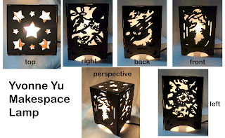 |
post process orthographic
|
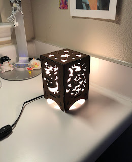 |
post process environment
|
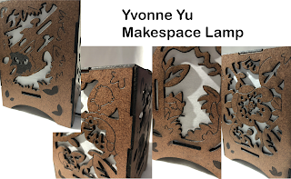 |
post process close ups
|


No comments:
Post a Comment