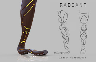
This is an original concept for a transfemoral
(above-knee) prosthetic device called RADIANT.
I was doing some initial
adventuring online, as is my habit when I’m looking for interesting design
ideas and novel concepts for prostheses, when I came across this image from the movie Ex Machina:
Ex Machina, which features a main character who is AI and is
given a cyborg/humanesque body. The way areas of her form match up with and
flow next to each other is beautiful. There are areas that look almost like human
skin or biomechanical fabric, and areas that become completely transparent and
reveal the machine beneath. This idea had a lot of potential, so I kept
browsing, in search of some supporting idea that would lead me to a more
concrete notion of my own. I soon came across this artwork from Rocio Montoya,
which really got me questing for more in this line of ideas:
Then I found this artwork from tekka-croe.deviantart.com,
and it thoroughly captivated my imagination...
My thoughts began to solidify, and I decided I wanted to
design a prosthetic device that was visually adjacent to these works of art.
The smooth surface layers revealing an offset robotic interior would create an
intriguing piece, so I started drawing some concept art to try to capture how I
would bring my own concept to transfemoral prosthesis.
My brainstorm sessions usually start out very
broad, where any idea I have basically gets to be on the initial sheet of paper
with zero criticism. I don’t start judging until I’ve slept a little and had
time to compare concepts – which seem to work visually and functionally, and
which might not be so appealing after they’re modeled. I also did some research
into the musculature of legs, and decided to very loosely imitate the curves
created by overlapping muscle. Around the ankle, it would depart from the shape
of a human leg and enter the world of geometry and robotics – this effectively
(and conveniently) removed the need to design an ankle joint. I referenced
athletic prostheses and simple arched foot designs, such as the type Oscar
Pistorius wears for sprinting, for ideas on how to design a joint-less foot/ankle.
A good example is the BioStride foot from HI-Tech (www.humanitechnology.com/prosthetic-feet). Additionally, I researched the
types of sockets associated with a transfemoral amputation. This image from the
Northwestern University Prosthetics-Orthotics Center shows the difference
between two types transfemoral sockets. I chose to design a prosthesis using a
sub-ischial socket. The Center has also developed vacuum-assisted suspension (to
accompany these designs) that improves comfort within the socket and around the
pelvic area. (http://www.nupoc.northwestern.edu/research/projects/lowerlimb/dev_subischial.html)
This image is my first
brainstorming sheet of “any idea that pops into my head”:
My final decision was how I planned
on handling the knee joint, since I wanted this to be an above-knee prosthesis.
Since I’m not an engineer, as I believe I’ve stated before, this time I made
the choice to use an already existing prosthetic knee that could fit inside my
design. The C-Leg made by Ottobock is a microprocessor knee
(www.ottobockus.com/C-Leg.html) that comes extremely close to imitating a real,
responsive walking motion. According to their website, “The
microprocessor-controlled leg prosthesis system is ideal for anyone with high
stability and reliability requirements in everyday life.” If I were an
engineer, I would’ve wanted to design this. If I were an amputee, I would want
this leg. However, I would want the exterior to be highly customizable, because
I’m an individual (and an artist) with specific tastes. To be fair, Ottobock
does offer three different variations of protective cover you can purchase
separately for your C-Leg, assuming that one of them suits your style. I took
the liberty of basically modeling a C-Leg into my Radiant model to the best of
my ability (and using reference images), with a slight difference in the knee
joint to thoroughly sell the concept. I also think the Very Good Knee (VGK-Go!)
from OrthoMobility (www.orthomobility.com/) is an aesthetically pleasing knee,
and it gave me ideas for the slightly different knee joint that would look
better with this new design.
Finally, what would really finish the Radiant concept would
be a way to make the internal surface a real-life emissive material, so that
light could radiate from the gaps between the exterior surfaces. Light-emitting
materials today are limited and expensive, but LEDs are not. The interior
surface of Radiant would emit light through a translucent material via embedded
LEDs of basically any color the person wanted (the exterior surface would be a
customizable color as well.) Ta-da! Now, the real work can begin.
A transfemoral prosthesis, as far
as 3D modeling is concerned, is made up of roughly three functional key elements
that I needed to concept: a socket for the residual limb, a knee, and an
ankle/foot. I say “roughly” because my concept actually integrates the foot
with the ankle joint and lower leg, so that the design is one consistent,
flexible piece. The rest could be left up to my imagination to create.
For portfolio purposes, I wanted to
elevate the renders of my prosthetic devices by providing them with some
context – which led to the decision to spend some time up front modeling a
realistic human body. There were some important criteria I needed to meet for this
to be the correct aesthetic decision but also useful to me as I modeled my
devices. First, the modeling of a human body had to be done in Maya to achieve
the desired level of realism, as well as the closest possible proximity to the
original form of a leg. The Hanger Clinic’s website explains in medical terms
why every good prosthesis is a custom prosthesis (www.hangerclinic.com/limb-loss/adult-lower-extremity/Pages/Above-knee-Prosthetics.aspx).
For my purposes, what I took from this research was that everyone’s residual
limb is unique, its housing must be made to fit the individual, and ideally the
design will complement the person’s body type. I began strategizing now that I
had this information. Organic modeling in Rhino - a NURBS modeling environment
- is possible, but stops just short of torture (for me, at least), and also
doesn’t produce the same results as organic modeling in a polygonal environment
like Maya. Alternately, hard surface modeling is a much more pleasant and
efficient process in Rhino than it is in Maya (primarily a polygonal modeling
environment). Secondly, the body needed to be realistic, but not so realistic
that the polycount got too high (a.k.a. the number of polygons in the model).
By keeping the count low, I could export the mesh model from Maya into Rhino,
and then convert the polygonal mesh object to a NURBS object that was simple
enough to allow me to pull vertical and horizontal curves from, utilizing the
actual form of the original body to design a prosthetic around. This would get
me as close to the form and volume of the original leg as possible, short of
performing a 3D scan of someone’s real leg. Beyond the requirements I created
for myself to lead to success in this project, it seemed fitting that I should
spend my Capstone semester teaming up the very different worlds of polygonal
and NURBS modeling. I have worked hard to become proficient in both during my
time at UTD, and I find myself on a regular basis describing to people who are new
to modeling the ways in which Rhino and Maya complement each other, and which
method has proven better for me in varying situations.
Character Model: Maya
process and tools:
I have modeled a couple of characters
in Maya before (both male, and both for animation), but it’s been a while, and
it seems like every time I neglect one software in favor of another for a few
months, I forget everything I’ve ever learned about the first one. Therefore,
my foray into modeling a realistic female body started with rereading both
spirals I had taken notes in from Modeling & Texturing 1 and 2. I did TRY to start modeling without reference
to notes, and ended up wasting a lot of time right up front. That’s okay! It
wasn’t too much time, and it brought me back to reality. This is why I always
take notes – no one is better at explaining something to me than myself from two
years ago.
I
went a little off-script with my female body model, wanting to keep it in that
friendly area of not-too-high poly and not-too-low poly. That mostly means I
didn’t adhere to the general rules of 8-sided cylinders, since I thought I
could get away with fewer, for the sake of low-poly modeling. I did NOT,
however, give in to having triangles or N-gons, so my conscience is clear on
that. I’ve also learned from more than one modeling professor that human bodies
are essentially “tubes connected to other tubes,” so this is how I always approach
the beginning of a character model in Maya, human or not. I started by having proportional front and
side reference images of a female body, so that I knew I wasn’t straying from
the basic rules of human anatomy or making anything up. I roughly modeled the
torso was first, then I branched off to the arms and legs, and then the hands
and feet. The face and head are always the difficult parts for me. I started by
modeling edge loops around the eyes and mouth and getting them exactly where I
wanted. After that, I bridged the gap by creating a nose. From there, I
extruded out from the sides of the eyes to start forming the shape of the jaw
from the front and side views. After getting those roughly in place, the
process of appending, bridging, redrawing edges, and pushing and pulling
vertices to make an appealing-looking (but low-poly) face is really something
that takes me a long time to do. Then, connecting some low-poly ears (the only
parts that I didn’t model realistically for the sake of poly-count, and also
since there was no need) and the rest of the head was relatively simple.
Lastly, I extruded the torso up to create a neck, which I then connected to the
lower mesh of the head. The final step was modeling some simple clothes, since
she was going to be used for renders. Making a basic shirt and a pair of shorts
is as simple as extracting a portion of the torso and legs, then scaling them
up and rounding them out to lay on top of the body. I also modeled some simple
sunglasses in Rhino, since she seemed like a sunglasses person, and her eyes
were looking a little dead without a realistic texture. I learned a few tools I
hadn’t ever used before in Maya, but I’m not sure how much I’ll continue to use
them. I’ve found that most people build a small collection of tools they’re fluent
with in Maya, and if you’re good at those, you don’t necessarily need to know
the full, outlandish range of tools available in the software. I have hotkeys
for about 20 tools I use regularly, some much more than others, and some with
way more power than others. Here are a
few I got familiar with during this model:
CollapseEdge Tool (Edit Mesh>Collapse) : select two parallel
edges, then collapse the components and merge the vertices of those components.
A handy new clean up tool for handling unmatched mesh flow from one object to
another that you’re combining.
ChamferVertex :
Select a vertex and flatten it into a face with four verts.
ConnectComponents
: (can insert a connecting edge that respects your edge flow on one side) Lets you create an edge loop by selecting a
concentric edge loop that may not have consistent flow on the other side.
Radiant Modeling: Rhino
process and tools:
After extracting the leg mesh from
my Maya model and exporting it as an obj into Rhino, I used MeshToNURBS to
convert the object into something useful for NURBS modeling. I then chose
horizontal loops around the leg that were doing the most work defining the form
of the leg, and I used DuplicateEdge to select those “edge loops” basically,
and to duplicate and join them into new closed curves. I used Rebuild to place
the polycount exactly at 8 and to bring the degree up from 1 to 3. This would
give me a simple, rounded loop that defined that particular horizontal portion
of the leg, but wasn’t too detailed. When creating these loops, the goal is to
make them consistently spaced, equal in point complexity, and have their points
lined up with the others vertically. I continued this process all the way down
the leg, through the ankle, and to the end of the toe. This design doesn’t
incorporate an ankle joint, so the form is continuous and flows all the way to
the toe. After the horizontal curves were roughly in place, I could use
InterpolatePoints to draw vertical silhouette curves from the front and side
views, using O-snaps to make sure they were intersecting the horizontal curves at
the correct control points. Combined with some vertical curves I had pulled
from the mesh leg, these would pair up with the horizontal curves to create an initial
surface. The transitional area around the ankle and heel was more difficult to
define, since I was getting ever closer to organic modeling in Rhino, which I
mentioned was worth avoiding. I had to be very selective about what curves to
use for building the surface, depending on how true to the original ankle I
wanted the new surface to be, as well as how difficult I wanted the next part
of the modeling process to become. The simpler the base surface is, the less
troublesome the surface becomes later when you’re modeling details into it. To
simplify my surface creating process, especially since my prosthetic concept
didn’t have a realistic foot anyway, I created a flat, closed curve from the
top view that would be the basic shape of the sole. Around this point, I
imported my concept art into the scene, using PictureFrame to create reference
planes that the front and side views of my concept art could be attached to. I
had a general concept drawn out of what the shape of the sole should be, and I needed
to start referring to the curves of the concept, as well as the curves of the
original leg mesh. I didn’t know yet if the sole curves I was creating would be
used as part of a curve network, or if it would just be a reference for me
while I drew continuous horizontal loops that could eventually be used for a
Loft. It’s worth having both options available to you, especially since you can
get quite different results from those two surface building commands. I also
created a 2D curve from the side view that would be the silhouette shape of the
curve for the sole. The side view looks very much like the side of a foot, but
the shape from the top diverges from a traditional sole shape and becomes very
robotic, and much slimmer in the front than a biological foot. After testing
for clean curves using CurvatureGraph and CurvatureAnalysis, I used Crv2View to
get an in-between curve that combined the two perspectives. This would provide
me with a good sole to start attaching the vertical curves to, effectively solidifying
a potential network of curves to form a 3D object later (assuming, after
testing, that it looked better than a Loft). Before I moved on, however, I used
Rebuild to simplify the new curve. Then, I began testing surfaces! This was a
period of a lot of trial and error, which is how it usually goes. I tried
several versions of a surface using NetworkSrf, but none of them looked as
attractive or as close to my concept art as the surfaces resulting from a Loft.
Therefore, I next created additional curves to define the cross sections of the
foot. After lofting and using a Patch and BlendSrf to close the toe area, I
tested many of the control points in the ankle and foot to make sure I was
getting an attractive “foot” shape, even if it wasn’t the shape of a foot. I
made sure a heel and a weight-bearing “ball” of the foot were both still
present, but otherwise left it to my concept art to define the silhouette. I
also used CageEdit (which is relatively new to me since I’m partial to being able
to adjust vertices in polygonal modeling) to adjust the overall form a little
bit. This roughly allowed me to sculpt a surface, but without the specific
control points that made up the surface, which can be a little messy.
I next turned to creating an inner offset surface from my
base surface by using OffsetSrf at .2”. The resulting surface was not
incredibly clean, but using Rebuild didn’t result in an inner shape that was
consistent with the outer shape, so I decided to keep it. I didn’t anticipate
any problems, because the inner surface was not going to be modeled on after
this action. It only needed to provide an anchor for the sectioned shells that
would make up the outer surface. I used this same method for creating the
“super inner” surface that would actually be the part of the inside that
touched the stump or held the C-Leg in place. I offset the base surface by .5”
this time, used Rebuild to clean it up, then used a CutPlane and Cap to close
off the bottom at a reasonable height. The foot/ankle needed to be a solid
piece so that it remained sturdy though flexible, but above the ankle could
become hollow to accommodate a pylon and knee system. From here, I turned to
creating the joint mechanism for the knee. I didn’t want to get too far into
the design process before I addressed this, since form traditionally follows
function for good reason. I had already decided to model a microprocessor knee
system based on an existing prosthetic knee, but with a little variation to go
with my original concept. Infinitech.org is a great resource for reading up on
the types of knees that are available today, from very basic single axis knees
to microprocessor knees that are highly computerized and intended to react and
adapt like a biological knee. The knee that I chose to refer to is the C-Leg
from Ottobock, a prosthetics and orthotics company responsible for many prosthetic
innovations in recent years. I don’t claim to know the engineering behind the
C-Leg, but I can model an exterior that looks similar to it, and say my overall
AK prosthetic design is intended to accompany a C-Leg. I started with the wheel
structure I wanted to be the base for the knee. Using a half-circle, a Revolve
command, a base cylinder, and a BlendSrf, I created the joint shape. There was
probably an easier way to do that. I created the rest of the knee joint via
drawing 2D curves and extruding them, then filleting edges, and using
Boolean2Objects and BooleanIntersection to get the solids I wanted. Once the
knee was in place, and I knew the exact space it would occupy, I could move
back to the surfaces that make up the exterior part of the prosthesis. I
started by defining the cut-offs below and above the knee joint, since the knee
was going to be exposed in the final design. By using a combination of
projection, using Interpolate Curve on Surface, and the Pull command to get
points back onto the target surface, I got the exact shape I was aiming for
around the knee, and I applied it to all three surfaces (the exterior,
interior, and what I’m calling the “super” interior, which was the surface that
would be in contact with the sock.) I used BlendSrf with added custom shapes to
build the smooth, rounded surface that connected the inner surface and the
super inner surface. For the outer shell design, I drew InterpolateCurves from
the front and side perspectives, then used Project, ProjectToCPlane, BlendCrv
(a command I hadn’t used before, but turned out to be basically like BlendSrf
in 2D), OffsetCrv, OffsetCrvOnSrf, InterpolateOnSurface, Intersect, Bend, and
Pull, and Rebuild to get my final outlines. I also had to use SrfSeam to adjust
surface seam positions after I got the intersecting curves figured out, because
they weren’t ideal in their original positions, even though I had tried to
place them intelligently while building the surfaces. I needed to be very aware
of how the surface seams would affect any UV layouts I decided to use later.
Placing them in the center of a surface-to-be would make for better symmetry,
and placing them in between areas I needed to manipulate might mean I could
avoid them altogether.
Then, I finally started using Split on the surfaces with the
interpolated curves. I used OffsetSrf (solid or not), BlendSrf with custom
shapes, CageEdit, and FilletEdge to get the resulting shell surfaces that make
up the outer design. I then used BooleanDifference to remove the part of the
shells that intersected with the inner base of the leg. This ensured absolute
intersection and closed polysurfaces, which are both necessary for 3D printing.
My final step was to use FlowAlongSrf with CreateUVCrv in
order to create textures on the surface of the outer shells. I did several
tests with a few concepts I had drawn out in the beginning of my design
process, but none of the test renders received any love from my test subjects
(I run major design leaps past a few trusted, artistic friends before
implementing anything officially). So, in the end I decided Radiant looked more
complete and aesthetically awesome without any additional texture on the
exterior surfaces. In most cases of design, less is more anyway.
Materials
in Keyshot:
Radiant’s
design success depends partially on emissive materials, so it’s fortunate that
Keyshot has those. For the interior surfaces, I used a warm emissive material
with different diffuse colors that complemented the exterior surface materials.
The exterior shells have either an Axalta Paint or a regular Paint material
applied to them. The Ottobock C-Leg parts have titanium applied, as well as
silver and ginger bronze paint materials. The grips on the foot have a
mold-tech plastic material applied that imitates dimpled rubber. The female
model has a translucent human skin material applied, which makes her look like
a mannequin when no bump texture is applied, and a basketball when a bump
texture is applied (it also greatly
increases render time), so I decided she looks fine as a mannequin. Her clothes
are nylon fabric, and her sunglasses are Axalta paint and basic grey glass
materials.
Materials for 3D Print:
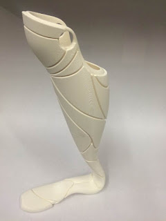
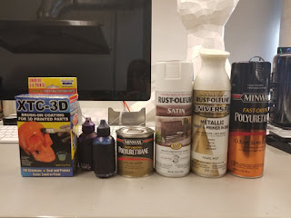
I 3D printed this design in ABS-M30, which is a good material for prototyping because it has "great tensile, impact and flexural strength, and environmental stability" according to Stratasys. I chose to print it in two pieces, because it turned out that it was going to be a reasonable price at full scale, but it wouldn't really fit on the build plate at full size. After the lengthy build, which took almost two days, I adhered the two sections together using a glue that contained acetone, which partially melts the ABS and does a great job of joining ABS to itself. After waiting a day, I started the process of applying multiple layers of XTC-3D to the surface, in order to level out the 3D print signature, which always ends up looking like a topographic map in certain areas. To keep the XTC very thin, I added isopropyl alcohol to the mixture (2 parts A, 1 part B, 1 part alcohol). I ended up painting three layers of XTC over the course of a week. Afterward, I was rewarded with a fairly thick, even surface that could be sanded down to get a rough, but still even, surface that would be easy to paint. Before I started sanding, though, I filled the crevice between the two parts with a sculpting putty that would also be easy to sand down after it dried and set. Another 24 hours later (there was a lot of waiting in this part of the project) I sanded down the entire surface - sanding it perfectly took about a day. Next, I launched the painting process. The first layer was simple polyurethane. The second layer was a white matte primer. The third, fourth, fifth, and sixth layers were polyurethane mixed with SoStrong tints - I aimed for a vibrant indigo color that was a little transparent due to the nature of polyurethane. After that process, which took another week, it was time for two layers of white pearlescent paint that was sprayed on evenly in two coats. The final coat was a yet another layer of polyurethane to protect it from damage.
3D Printed Prototype:
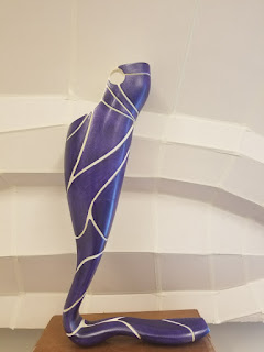
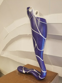
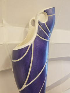
Materials:
Here's a link to my presentation regarding this design, as well as Anatomic (a below-elbow prosthetic device):
Here is a collection of reference images of prostheses, cosmesis, and general inspiration:
Sources:
tekka-croe.deviantart.com
Prosthesis/Cosmesis
companies I found:
https://glazeprosthetics.com/
http://unyq.com/prosthetic-covers/


No comments:
Post a Comment