Monday, October 31, 2016

Brandon Wehenkel: Longboard Engraving


Photoshop Original

Photoshop Final


Rhino example


Concept:

I don't skate.  My brother does.  Since he does I asked him what he wanted on the bottom of his longboard.  When I was younger I got an email while I was away from home that my brother had broken his collar bone while longboarding down a steep hill.  He told me he wanted an omage to his collar bone on his longboard.  Longboard  Inspiration


 X-ray

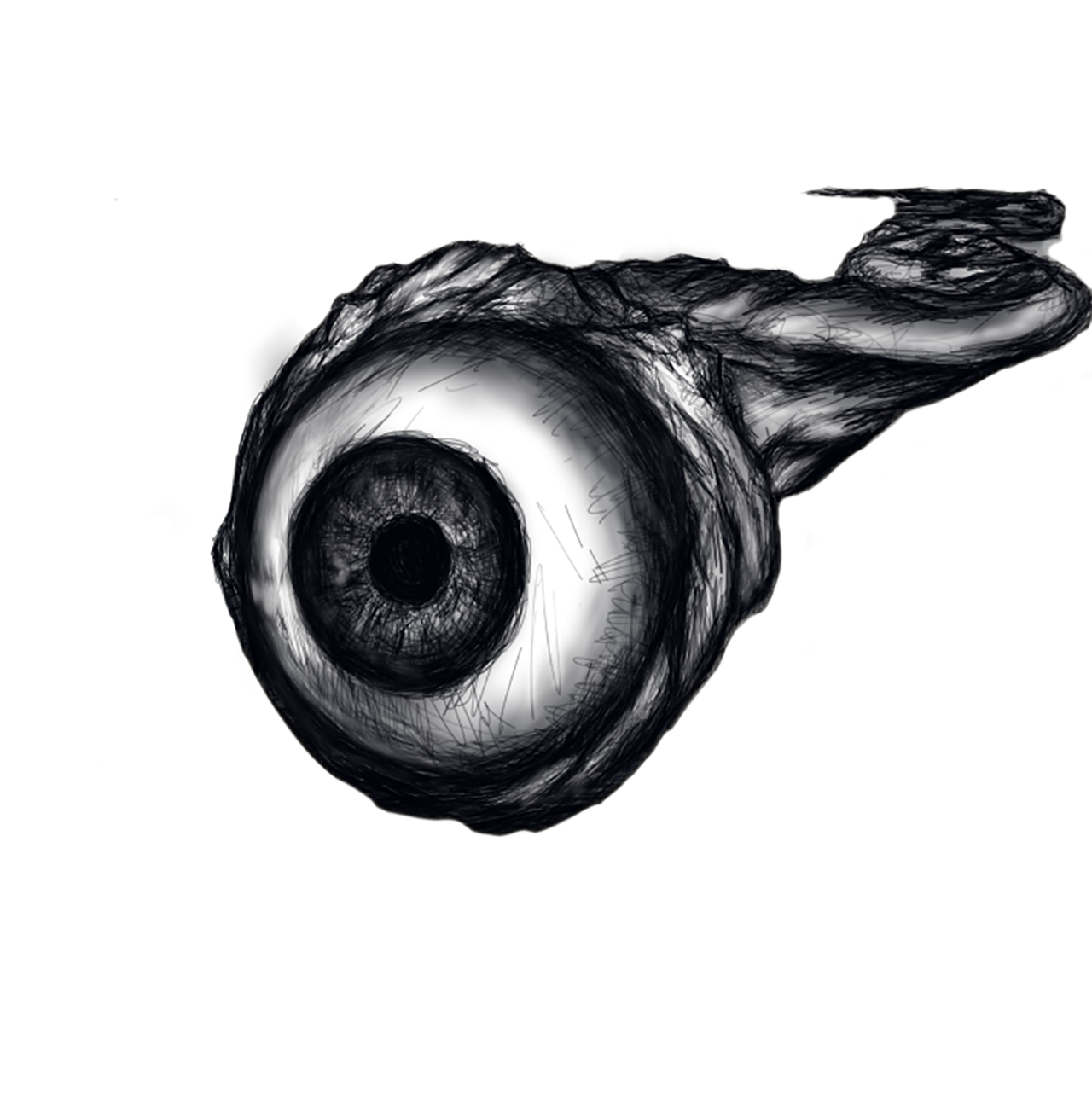
Predator Organism Radiolaria
Vertebrae seen through an electron microscope


Modeling Techniques:
I uploaded the images to photoshop and photomanipulated the images to the longboard example I gave in the concept.  I used curves and saturation to create a very blown out image.  I used various tools in photoshop: eliptical, rectangular, magic wand, quick selection tool, brush tool, spot healing brush, healing brush, patch tool, eraser, paint bucket, lasso tool, eyedropper.
In Illustrator: Image Tracing, Pen Tool
In Rhino: Scale 1D, Dimension --> Linear Dimension
I ended up ditching the Rhino & Illustrator idea and just manipulating the image in photoshop till I got a very different appearance.  The design wasn't very cooperative with the laser engraver so I ended up enhancing the contrast with the exposure setting.  I adjusted gamma to .26 (almost all the way to the right) and I adjusted the exposure to multiple different spots: I started on a lower adjustment of +1 and I believe I adjusted it to +14 for the final design.  Because of this I lost a significant amount of detail.
I had also used pixelation and greyscale to my advantage to get more detail out of the shadows that I wanted in the X-ray, without the pixelation I would have lost all detail.

Materials:
The longboard is made of pine.  I did a test on Oak because I had an excess of that wood at home.  Its an expensive test, but I didn't want the wood to go to waste.  I ended up not doing a 2nd test and just editing the design five different times to be printed on the pine board.
I used a spray on sealant to clean up the exposed laser engraved areas.  But I didn't want to use paint on with a brush because I fear that I might have some slight clumping in the pixelated area.

Final

Chelsea Griffin - Week 11 - Laser Engraving: Skateboard Deck


Concept : For this assignment, I knew right off the bat that I wanted to engrave a drawing onto my skateboard deck. I wasn't initially sure what kind of drawing to put on the board, but I knew that I wanted something that could somehow represent my own artistic identity. I might've mentioned in an earlier assignment that I often incorporate eyes into my work. I appreciate not only the aesthetic of the eye but also the deeper concepts that have been associated with them throughout human history.

Initial Sketch in Autodesk's Sketchbook


After using Image Trace in Adobe Illustrator

Image in 1-Touch Laser Photo

Test engraving on medium-density fibreboard

Deck after laser engraving


Deck after coated with transparent black stain, sanded, and finished with Watco Danish Oil (Medium Walnut)


Techniques : I drew the eye in Autodesk's Sketchbook using the pen and pencil tools, as well as a bit of airbrush. Once satisfied with the image, I opened the file in Adobe Illustrator and used Image Trace. I decided to raster the entire image.
Materials : For the trial engraving, I used some material that I had on hand called MDF (medium density fibreboard). It's not the same material as the wood of the skateboard deck, but I still felt it gave me a rough idea of what the final engraving would look like and helped me determine the different aspects I needed to fix in my Illustrator file. I stretched the file a bit when putting the image onto my skateboard template. I realized after the trial engraving that I didn't much care for this and plan on scaling it back to it's original state.
Once the deck was engraved, I decided to bring out the engraving a bit more by using a transparent black stain. After this, I lightly sanded the board in an attempt to get rid of the intense glossiness of the laminate that came with it. Once I was satisfied with the texture, I went over the entire board with some Watco Danish Oil. 


Sunday, October 30, 2016

Michael Crow - Week 11: Laser Engraving: Deck

  • Each persons skateboard Deck is meant to showcase who they are. In this case the person I am making a board for has an online persona named Cody, a DJ, skating Dog, much like McGruff, the crime dog. I wanted to make sure this board was unique for him. With a custom hand drawn image. His name and a backdrop logo of his favorite skateboarding company in the background.


Fig. 1: Designs

 From this point I had to try several different techniques to get the best representation of the regional image and nice background. Starting with the One Touch software I started with Posterized images, and found that I really liked the fully colored image much more. Knowing that I changed the way the background was displayed to better show the "DC" Logo. After seeing how the deeper levels came out io Decided to keep the background as a Raster and simply go in and cut the Name and Chest Tattoo deeper to help them stand out, as they got lost in the test engravings. In final I moved a grey scale version into Illustrator and using Image trace I cut out pieces I liked to engrave deeper.

Fig. 2: Tests

  • This test and adjust approach allowed me to do several low cost small test runs with the laser at different Powers and will help the skateboard look clean and help keep away from any major burns. As well as to help make the whole image pop across the board.

Taking this knowledge I moved and redesigned the Imgae to allow for a culmination o the two designs. I kept the gradient fade from the supposed final design, and the colors and raster from the first design. Which left a much better contrast between the name and he logos on the board as seen in Fig. 3


Fig. 3: Logo Detail

A deep ebony stain was applied into the groves for the name and the characters dog paw tattoo, to help them stand out from the other engraving and help the viewers eye continually circle around the board as seen in Fig. 4


Fig. 4: Stain Detail

Finally I applied a triple thick coating of Polyurethane across the whole board 3 times, sanding the ridges and each coat with 400 and 800 grit sandpaper to help remove any imperfections caught in the coat and to help the next layer stick and have more surface area to maintain a better hold. Which gives the board enough protection to be used or displayed without worry. It also leaves it with a slightly glassy and buttery feel up close but without removing an detail from the board itself.

Fig. 5: Raster Details

Finally we have the finished product ready to be shipped to the patron, who is exstatic with the results!


Fig. 6: Final Product


Monday, October 24, 2016

Niveda Subramanian - Week2 - Duck


Concept: For this specific project, I decided to model my duck after my high school French teacher. I attempted to recreate many features of my French teacher on the duck, such as her prominent bun and fancy jewelry. I showed my teacher my model, and we both had a good laugh out of it!

Modeling Techniques: For my model I followed the instructions posted on the blog site and added my own personal twists. At first, I created normal eyeballs for my duck, but then because my French teacher wears thick-rimmed glasses, I decided to exaggerate this characteristic. I used many spheres throughout the model, as can be seen in the hair bun, necklace, and the hunch on the back.

Materials: For my KeyShot rendering I used a marbleized texture for the body and face. I really liked this texture because it created a beak in itself, and also enhanced the hunch on the back. for the hair bun and the bottom of the duck I used a metallic gray to create a mellow atmosphere. I chose the colors red and purple because both are piercing yet subtle.

Niveda Subramanian : Week 1 - Castle


 Concept: For my castle project, I decided I didn't want to stick to the typical castle. My inspiration came from two of my favorite Disney movies, Frozen and Aladdin. The design elements of the castle, from color to structure, draw from elements of each movie. For example, I decided to use a vibrant teal color, because Jasmine wants to travel the world with Aladdin, and the last thing she wants is for her home to be dark and dreary.

Modeling Techniques: In my Rhino model, I first created a rectangular plane and used a series of curves and arches to create the structure of my dome. The interweaving mesh pattern was a constant throughout the castle. I used the loft and surface offset tools quite often throughout the process in order to combine my surfaces.

Materials: In my KeyShot rendering, I used metallic teal paint, and varied the roughness and brightness of the object to enhance the stylistic elements of the dome. For one of the arches of the castle, I used a light gray dielectic texture to bring some contrast to the model.

Monday, October 10, 2016

Travis Fowler: Midterm

For this project, I wanted to explore the implementation and application of procedural patterns made using grasshopper in digital fabrication. Having never made molds, the second thing I wanted to focus on was effectively making molds and castings using advanced mold-making techniques.

I spent a lot of time this summer researching grasshopper and finding tutorials to better help my understanding of grasshopper.

One of the most valuable resources I found was CO-DE-IT, a blog dedicated to the exploration of grasshopper scripts.

I used a code found on co-de-it called hex chaos as the base for my pattern. I spent a lot of time exploring the methods used for seeding random patterns and dividing predefined surfaces.
This is a snapshot of the Hex Chaos code out of grasshopper.

Here are the surfaces I extracted the pattern from to make the round vase and the flat reliefs.
Below is a picture of the relief positive after being covered with a coating of urethane to seal the MDF.
Relief mold
3D printed vase after coatings of XTC-3D (upside down)
I determined that the vase would be a better candidate for the brush-on mold because of its size. (2nd coating of rebound 25)
Third coating of rebound 25 with seam for cutting the mold to free the origional
Making the mother mold for the vase proved to be difficult. I had to make a 2 part mother mold to avoid mother-mold lock. The picture below is of half the mold being covered to allow half the mother mold to be made.
After the first half of the mother mold was done, I placed tape along the edge to prevent the second half from binding to the first half.
I wanted my relief castings to have a base plate that mimicked a honeycomb and the pattern found on the relief castings themselves.
Baseboard Finalized
Extra casting with hardboard mount for individual use
These are the castings I chose to mount on the baseboard

I wanted to explore these Grasshopper and mold making techniques as well as making something functional, the base board and castings are made to be a table centerpiece and the castings can be removed to be used as coasters or hotplates. The vase is used to hold flowers as table a decoration.


Darrius Williams =Three-Eyed Frankie (Frankenclyops)

 The Concept of my project is a three-eyed Frankenstein-like creature, its a fusion of Frankenstein and a cyclopes. but instead of just a one-eyed monster mash ,I instead gave my character 3 vertical eyes with gaunt features.


i choose not to use the xtc on the bust model but i did on the flatBack. i wanted to have a difference in textures to compare with each other.  after hot glueing them down to the board I did a brush on for the flatBack while a pour on mold for the bust.


 because of the shape of the bust I felt using the clay for my mold walls would save me the most material and also be a good alternative support compared to the metal flashing.


 after doing a few relatively normal casts i began to experiment with both painting the models with acrylics and the different dyes as well as mixing the materials. I for my cast I used combinations of the color match 325, ONYX, white liquid plastic, liquid rubber and plaster. due to a few issues with the 325 that can be seen in some i changed locations from the 4th-floor atec building to the sculpting studio in the art barn,doing so dramatically changed the performance of the 325. i wanted to express both ways of casting and coloring the materials  by both using different dyes at different points of  the  part A and B as well as painting and clear glossing one of the flatbacks and two of the busts.


As I explained above, the color match 325 was have weird issues in the atec building but  after moving the material cast solid consistently and had reduction in bubbles in the cast. In a few of the flat casts I partially filled the molds and let the cure then took the cast out and replaced to allow a little air space so that the following cast material would fill dan cover parts of the first run.


Because we built molds to cast our designs I finally had the chance to really make the materials work for me. but due to issues with the color match i had to be a little bit more flexible in how i worked and where I worked. so since I was in the artbarn i was able to walk around the building and refresh my mind with new ideas such as casting with plaster and plastic together.