Wednesday, December 9, 2020

Madison Larmeu: Project 2 Box Update

Please read!

I'm aware that this is late and probably won't count, but I've wanted to post the photos that I took and the work that I did so I'm making this post just because! This project was one of my favorites this semester and something I got to start before everything imploded in other areas of my life SO I am just going for it, because it was fun and awesome to do and I want to share that with everyone. 

Concept:

As we discussed from the first project, I have a keen interest in the paranormal, the unseen world, the unusual, and from there, I wandered how I might translate this into the box project. I had a ridiculous amount of ideas and I stored them away in hopes that I might to get to create them in the future, but that's an entirely different discussion, back to the matter at hand:

"Witch Crafts" Shirt by Wicked Clothes

"Cthulhu" Sweater by Wicked Clothes

When I first began my search, I decided to peruse some of my favorite brands for inspiration: Wicked Clothes and CalamityWare. Wicked Clothes is an online clothing store that sells a vast selection of graphic t-shirts with quirky, spooky, and occult-inspired themes. Stylistically, I knew I wanted the box to have some depth or detail, but I couldn't determine what I wanted the theme to be exactly.

"Platter: Dinosaurs" by Calamityware


Next up I began perusing CalamityWare, a brand that sells beautiful porcelain ware that has a fun twist! They feature a variety of dinosaurs, aliens, and mythological beasts and creature hidden away in the details of the patterns. I loved the idea of incorporating something with intricate detail, although I wanted my design to be a bit less subtle then Calamityware. It was actually after I purchased a few of these products for Christmas (YES I know I was early, but this has been a brutal year and I wanted to make sure I got presents for my family and friends and had them ready because the holidays are rough in general...tack on a pandemic and serious mental frazzle and it becomes a living nightmare) that I had my A-HA moment!

My boyfriend loves personalized items, even more so when they feature themes that are of interest to himself and I, so I chose to do a 'space' themed box. The photographic style astronaut was meant to be representative of Will - clear and straightforward, quirky,  - and the astrological wheel was intended to be representative of myself - ambiguous, requires interpretation, detail oriented - so that both of us would be in the same box. Once I decided what my theme and reason were, I swiftly moved on to the fun bit.

Technique:

The first thing I did was set up my box using Makerscase which allowed me to make a box with teeth. I chose the sizing 10" x 8" x 4" for two very specific reasons: I wanted it to be the same size as the boxes we were ordering for my capstone project Let It Out, and I wanted it to be large enough to fit the small scrapbook I made for Will while also having enough for small cute items to fill it with. I thought long and hard about whether I intended to make the design a lamp and ultimately I decided that, based on what I wanted my design to look like and its purpose, I would keep it as a box instead. In the future, though, I have a few designs that I think would be easily adaptable to a lamp and do intend to one day create those. 

Astronaut

Once I decided on the structure, I had to decide whether I'd create the design with Rhino or Adobe Illustrator and, in the end I decided to use Illustrator because I'm a lot more comfortable using it over Rhino and I felt that I would enjoy the process more (which I did) because of that familiarity with the program. I began with the astronaut and utilized an image I found on the internet. I used the make and expand image trace tool and modified the parameters to maintain the black and white cut out while also maintaining some of the detail present in the photo. Then I mapped and aligned the astronaut to the elongated sides of the box and cut out any 'unnecessary' material.


The astrology wheel took much longer than the astronaut, despite having an easier gradation to work with. Like the astronaut I used the image trace tool, then I had to go through each and every symbol and smooth out any jagged edges lines - I also took the liberty of making some slight modifications to them. Afterwords, I stripped the wheel entirely and recreated it because the image trace left it in shambles, but I tried to recreate it to look similar. After the clean up, I began to contemplate which areas I wanted engraved, which areas I wanted to stand out and how I was going to cut the wheel in half and reflect it onto the other side - truly the most frustrating part of the project. 


In order to reflect the wheel, I first had to slice it in half, then I reflected it across the y-axis AND the x-axis (so that it read correctly). I did have to make some changes, such as, to keep the letters where they were, I had to manually move the astrological illustrations to align with the appropriate text. After I finally laid the box out, I decided to finish it off by modifying the 8" layers to be more rounded. I thought it would accentuate the astrological wheel more appropriately and reduce blank space that wasn't adding anything to the design. Off the the wood shop it went after that, where I experienced the other problem of COVID restrictions and regulations.


Materials: 

For materials, I chose to use plywood for the basis because its cheap and I knew I wanted to use a material that would bring a little bit of warmth back into the design. If possible, in the future, I'd be interested in remaking the box with a thicker plywood so that when it's being laser cut, the burns will be more defined.

When the box came out of the laser cutter, the first thing I did was start planning out how I would better define the areas to enrich the color of the natural wood without masking its quality. I chose to use a watered down acrylic paint (that was sealed afterwords) because I knew I could mix colors to get the desired 'stain' look I was seeking and because I knew that I could water down the colors and easily wipe them off if I had didn't like the way it looked. One thing I wasn't anticipating was how porous wood is, it quickly absorbed the acrylic which meant I had to work quickly to make sure that it would look consistent.


Tuesday, December 8, 2020

Hamsa Egal: Space Invader FlatFab

 I decided to make a flatfab based off one of my favorite Retro games Space Invader. For the design I just made a Flatfab of the enemy alien and tried to make it work. There are some technical differences between the look of the alien and my design but thats mainly because I couldn't work it to where the arms and antennas were front facing, but I incorporated them the best way that I could. I'm real happy with the design of it and this is something I genuinely would want to print out to see how it'd look in my room. 


Madison Larmeu: Flat Fab Project

 "Depression is a Beast"


Concept:
I thought for a really long time on what I wanted my final piece to be, I thought about various animals that I related to, various mythical creatures that I am fascinated by...but none of them spoke to me...My mental health has been such a mess this last year, and with added exterior pressures I felt truly hopeless, like a beast was trying to swallow me up and I couldn't escape no matter what I tried to do. And then I realized...I wanted to express this in my final piece for this course. I wasn't sure how it would be interpreted, which is why I wanted to discuss it further, but I decided to continue with this concept because I felt it not only was expressive of my own frustration and agony, but I also wanted to share with others that mental health is something that everyone struggles with and it truly does feel ghastly and beastly at times. 

While thinking about my 'beast' I decided that I wanted to refrain from too much abstraction, I wanted it to be clear that this was an internal 'beast' and so I decided to maintain a humanoid form. Furthermore, I realized I wanted something that would represent the 'two sides of the coin'; meaning I wanted one side to look more human-esque that would be representative of how I was perceived on the outside, and on the other side an abstraction of the physiological and mental chaos that I was feeling inside myself. 


Technique:
It took me an unseemly amount of time to try and figure out how I wanted to portray this in my flatfab. I began in flat fab, utilizing the mirroring tool primarily to keep it relatively consistent, but also wanted the piece to have a feeling of 'uneasiness' or 'odd' in which I chose to keep some components uneven (primarily in the chest area of the piece where I, myself, hold a lot of tension and discomfort). 

"The beautified version of the layout"


On the human-esque side, I knew I didn't want to portray the usual 'happy' mask that often frequents depression ads and campaigns, but rather wanted to highlight one of the key aspects that I struggle with when I'm depressed or going through mental stress: fatique. The rings under my eye suggest I haven't slept, and unfortunately ring true, but oftentimes people attribute this simply to the fact that I am a college student. But in fact all of my life one of the first things that I can no longer maintain when I'm in a distressed state is my sleep.


On the abstracted side, I wanted to highlight some of the pressure points where I feel tension, where the 'beast' puts pressure. I created these abstract, organic forms to be representative of the chaotic and clouded feelings I have in my mind. There are three eyes, the 'minds eye' is completely black, indicating there is a severed connection; the other eyes are tilted, angled downward to suggest that my vision has become cloudy, that I can't face what's truly ahead. My mouth is constricted with an usual abstraction meant to indicate that I'm unable to express myself. Originally, I wanted this constriction to be around the throat, but I couldn't find a way to indicate that without compromising the integrity of the other side, so I chose to indicate this with the abstraction around my mouth instead. Lastly, I chose to highlight the 'ribs'/'hands' around the chest area using a golden color that would show it was a prominent area of distress. I wanted the 'ribs' to look similar to hands gripping to indicate this is another area of pressure and pain.

After I finalized my design, I exported the piece as a .svg to pass it through illustrator so I could make it into a .dxf file to be transported into Rhino. Once I added it into Rhino, I assembled a prototype by duplicating the pieces to indicate what the final piece would look like if I had printed it.


Materials:

The materials I chose were to indicate either a plywood or cardboard base. The areas are painted solid colors that are in various grey tones for two reasons: grey tones are indicative of a depressive mental state, and because inside a home, this piece I would want to be an accent rather than a primary object of attention which means I needed to choose tones that were relatively neutral, but would still highlight various areas of intrigue. I chose gold as an accent color to the piece because I wanted to break up the monotony of the grey tones, but didn't want to make it stand out too much.

I knew that it would be a risk creating this design, but how I've felt the last few weeks, it felt like the best representation of a 'animal' or 'creature' (in a less literal sense), while also speaking about something that is near and dear to my heart. I really wanted this to be a project that spoke not only to the assignment, but to other students who may be struggling right now as well.

Monday, December 7, 2020

Wesley McKnight: FlatFab Project


Concept: For this project, I wanted to create some cost-effective home decor. I've always liked the idea of having plants indoors, but I don't trust myself enough to keep them looking healthy and appealing. So, I decided to create this 2D cactus for my project. Cacti were my first thought because of their large, flat leaves that could be easily translated into something like a flat-fab model. What I think is cool about this design is that the cactus could potentially be built to fit any height or space by adjesting the abount of leaves in the building kit and they can be painted easily. The amount of personal customization and ease this product has makes it perfect for anybody and any space. 


Tecniques: I messed around in Flat Fab for a long time, trying to figure out the best kind of cacti  to use as reference and debating wether or not to put a pot at the bottom. Once I had become familiar with the software , I took the sketch and put it into rhino to get the Layout you see above. 
Materials: The material of this products would be hard plastic (with a rougher texture so it may be painted easier). There is a lot of tension happening at the links between leaves, so the material has to be tough and not bend. 


Sunday, December 6, 2020

Sanika Dhawan: FlatFab Project


                        Concept: I decided to choose something random and ended up choosing a bee. I searched up images online and used them as references while making this design. I wasn't able to finish everything or add more details to the design due to a misunderstanding of the deadline in our class Group Me, which I apologize for as I should've emailed to confirm the date.


                      Technique:  I started making the design in FlatFab and then rendered it in Rhino. I used Linear Operations and the Transform tool frequently.


Jaedene De Jesus: Project 3 FlatFlab Tata

 Concept:


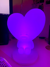
I was on my desk like every other day, when I finally figured out my inspiration for this project. I have a figurine light on my desk that I wanted to follow. My classmate Kenny had suggested to look up 3D cut puzzles, which helped me figure out what I wanted to make after getting inspiration from a Rilakkuma 3D puzzle (https://www.plazajapan.com/4580423514392/). Tata, a character from BT21 (https://www.bt21.com/main), which is a collaboration between LINES FRIENDS and BTS, is what I decided to base this project on. I had decided I wanted to combine the two ideas into one and make a Tata 3D puzzle.

Technique:


For the majority of the time, after watching the FlatFab tutorials, I experimented around FlatFab trying to figure out how I wanted to approach this project piece. I first started with the heart-shaped headpiece, and continued duplicating those, and aligned them accordingly. While looking at my lamp for reference, I adjusted each duplicate's height and width to make the round heart figure as smooth as possible. I then started doing the body, originally having vertical and horizontal layers, but later realized that it wouldn't work as a "3D puzzle". I then redid some of the heart layers that aligned with the arms and made those heart layers also have arms as one piece together. This allowed me to attach more layers into having more of a 3D shaped arm. 

Materials:

Just like every other 3D puzzle, I would like to imagine this to be cardboard as well. The heart would be red, and the body would be blue and yellow, just like the actual Tata character. 


Concept: Originally my idea was to do a flower or octopus but it soon quickly changed to a simple fish, largely because I like the idea of the water and an octopus felt like a bit much to attempt in FlatFab. My concept was to aim for simple yet ornate. I wanted to convey the environment of a simple fish requiring the it to be hydrodynamic. So the design was meant to be smooth where water would impact and to show some flare I went for wavy fin designs along the top and back. I kept the fins beneath it as a simple stand to not overdo the design and make it feel more stable. 

Techniques: I started with the body of the fish, making a very rounded triangular shape. I then went on to make a connector and the tail of the fish. I then decided to duplicate the tail and rotate it into the connector that would attach them to the fish's body. Moving on, I then made the stand of the fish. At this point the fish felt nice but still incomplete. So I went on to try and provide a similar design I used for the tail to the dorsal fin. I was limited in how I could connect the fin to the body so I bent the intended expression to reflect more of the flow of the fish through the water rather than layering the shape of the fin beside itself. I finished by adding a hole upon the body to make a simple eye.
Material: I would like the material to either be painted cardboard similar to puzzle pieces or a hard but flexible plastic. Both would keep the item light, provide durability, and keep the fish cheap. It would increase the appeal due to the reduced fear of breaking it, making it an appealing decoration for both. children and office workers who simply wish to spice up their office. The fish is easy on the eyes and comes in a easily customizable form as it could be encouraged to simply buy an uncolored version to apply ones own designs upon it.


Danny Laboda: Week 16 Flatfab Flat Rab(bit)


Concept:
For this project I chose to create my favorite animal: the rabbit. My original first draft of this project was entirely drawn, and I liked it so much that I had decided to render my final in my art program as well! Rabbits are a very important animal to me (Just ask my fursona!) But all in all I wanted a simple but recognizable sillouhette.
Techniques:
I fought with Flatfab for a good few hours trying to trace my concept artwork, but I ended up freehanding it. Since Keyshot still does not work on my computer and my rhino trial was up, I chose to do what I've been doing all semester; rendering in 2d with my art skills. I am really proud of how my render turned out!
Materials:
If I were to create this in real life, I would like for it to be made out of a matte plastic. When I was a child I had a toy that was just various mill cut pieces where you could create your own Flatfabs by sticking them together. I was very inspired by that toy and would want my rabbit to be much of the same.

Jackson Lanphere: Week 16 FlatFab Model

 Concept

I bounced around a few ideas in my head before landing on the hippogriff. In fact the hippogriff only came about because FlatFab crashed and I lost my work on the griffin I was making. When I tried to remake the griffin the feet looked more like hooves to me, so I made it a hippogriff instead to better fit the design.


Process

I tried to do this project without any training at first and it didn't go so well. I've worked with 3d puzzles and similar models before so I figured it couldn't be too difficult to make one. After a few minutes of being confused by FlatFab's controls I decided to turn to the tutorials on their website. Once I had the basic controls it wasn't too difficult, but I still felt that the controls were unintuitive. I struggled with the controls the whole way through this project. For a few of the pieces of the model I was able to mirror them which made the modeling process a lot easier. The legs were a bit awkward to make since each one needed to be a different shape, but I was able to get the general shape of one leg and edit that for each other leg. I used the linear generation tool to create the pieces that give the body and tail depth and then manually edited what didn't work. For some reason moving around in FlatFab made me nauseous. I also lost my work due to FlatFab crashing after I hit save. I'm not sure why I struggled so much with the program, even though I found it relatively simple.

Overall I think FlatFab is a good tool for anyone wanting to get into simple 3d modeling for free, but I feel that they may have oversimplified many of the features most people would expect from any program. However it is still in beta so I'm looking forward to what they come up with in the future.


Materials 

I wanted my hippogriff to be a small model that I could put on my desk. I have a habit of just putting seemingly random things around my workspace because I can't just leave it neat and clean. Most of the models I've made are made from thin pieces of wood and I tried to replicate that with my final render. However these are fairly cheap, made to be punched out of a thin sheet of wood, and are surprisingly fragile, so a stronger material would likely be better. Probably some sort of plastic or even PVC sheet. 


Michael Rodriguez: project 3 FlatFab model - The Crab.


Concept

               I began thinking about what I wanted to do for this project by looking over some of the provided examples in the flat lab planar studies Elearning page. I really liked Delaney Conroy’s conch shell design, and it inspired me to stick with an ocean theme. Seeing how she used some of her planes to construct the shell of the conch shell gave me the idea that the same idea could be applied to a crustacean type creature, and that train of thought made me want to design the oceans most popular crustacean, the crab.


Process

               I kept my process simple for this piece. I began by making a basic shape, then editing the points and curve manually until the shape was roughly symmetrical. I found that crabs have a conveniently symmetrical body, and I made this worked to my advantage by mirroring most of the pieces to make up the body of the crab and give it the familiar crustacean form that we are used to. Originally I wasn’t planning on adding the eyes, but I felt like I had to because without the stalky eyes the crab just feels like an ocean spider; and not a crab. In addition, one thing I found frustrating was the fact that the design is limited to how you connect pieces, which a leading issue for me in the design of the claws. Because of how I did the body, the first piece of the claw had to be a vertical piece, which made the connecting ligament a horizontal piece, which then connects to the vertical claw piece. I don’t like the shape of the horizontal piece that connects the arm/claw, but I’m not sure how I could’ve done it differently.


Materials

               I decided to give this piece a matte red material after experimenting with a couple of passes, mostly because I felt it was the most consistent throughout all of them, but also because it just completes the stereotypical crab look; with my design concept being just a crab, nothing less and nothing more, I figured that it would be best to not over due it with a complicated texture that doesn’t fit in all areas of the model. To go a bit further, this model should, in my opinion be laser cut into carboard or into a light wood. My reasoning for this is that because the claws are large, and the weight of the crab rests on its legs, the model is prone to falling over forward if printed in a heavy material such as metal or hardwood.


EDIT: the date says 12/16/20, this is meant to be 12/6/20, and is a typo, please disregard.

Rafael Villafane: Project 3 X-Wing_FlatFab


CONCEPT

For my flat fab project I decided to go with an idea that has always been close to my heart and that's my love for Star Wars, although I have had countless of different models of the X-Wing Fighter I wanted to make a model that was made by my own hands hence what you see in the picture. I wanted to make a model in which was fairly simple to build build but still be structurally sound since its such a back-heavy piece and that's where the legs on the bottom come into play so it supports the back-end so it wont fall forward as well as having the capability of hanging it on your ceiling on its center of gravity no problems whatsoever. 


TECHNIQUE

For my techniques I wanted to sketch out sort of the layout I wanted to use to model in flatfab which I messed around for a while trying to decipher how to properly use the software but I ended up using Maya to clean up a lot of the different polygons and edges. Luckily I was able to find good references online and even a 3D outline in which I used to make my dimensions a little more straightforward so when I laser cut it eventually it wont have over proportioned dimension. I started from the main structure of the X-Wing it being the main long body that then connect to the wings and the framing of the back which was the most difficult in putting it all together even with a good layout in place, and after that it was just a matter of putting all the little pieces and details together to have one solid piece. I rendered this in a regular shaded and green shaded lambert since you're able to see the shadows and details a lot more clearly than if every piece was colored differently.


MATERIALS

For the materials I wanted to go with the flat green shaded lambert color so the model pops out more in the scene and plus another separate render of a flat grey shaded lambert so I could make a cool future DIY at home project and actually paint this bad boy myself. With the help of Flatfab, Rhino, and some google images HDRi's I found a cool sunset scene out in the plains in which I could see this X-Wing fighter shine in the sky and gave me some dejavu of being a kid and imagining an x-wing dogfighting in the sky


Afifah Mazhar: Project 3 FlatFab Model


Concept:

The idea behind my FlatFab model came from some hanging paper balls I had seen while looking for decorations (as seen in the picture above). I really liked the idea of hanging something off the ceiling but wanted something more festive than the generic ball shape. As December has many holidays, I was looking for a something that would suit them all. Also, keeping in mind that it had to be something natural, I decided upon a star shape. However a generic star felt too simple and I felt as if it would not look very interesting if hung up. As such, I started researching different types of stars when I stumbled upon the fact that some stars are cold. This led me to thinking of combining the basic shape of a star with a stylized snowflake. I felt this would further bring the December/Holiday spirit to my model while also making it more interesting.


Technique:

I initially had a hard time determining how I want my model to look. For this reason I spent sometime looking up stylized snowflakes. When I started creating the model in FlatFab, I started with a basic geometric star shape. From there I added diamonds perpendicularly to the face of the star. I repeated this process once more to get both the diamonds on the tips of the star.

After doing this, I felt the model looked very flat. Even though I made it with the plan to be hung, I still wanted it to have more dimension. For this reason I duplicated and rotated the base star shape. Then, I duplicated the diamonds and moved them to the correct locations.

Lastly, I exported my model from FlatFab to Rhino. From Rhino, I rendered the final images and got measurements and cut instructions for the model.


Materials:

When I initially created this model I wanted to use paper as the main material for it. This was because my original inspiration was decorative paper balls (picture can be seen in the concept section). However, while creating the model, I realized that paper would be too flimsy to properly hold the shape I was wanting. For this reason, I think a thicker paper (such as cardstock or watercolor paper) would be better for my design. I think it would be a nice compromise between the original material and a solid structure.

 Chanlyr Jordan: UFO Model in FlatFab

Poly Styrene: Singer, Musician and Punk/Riot Grrrl Pioneer

Concept

    In the spirit of keeping a common theme, I've elected for Project 3 to design a little UFO desk toy in FlatFab. For those of you keeping score, yes, technically my theme is Kurt Vonnegut, and, yes, a life-size bust in FlatFab would be awesome. Unfortunately, my skills are not that awesome (yet), so I made this cute little abstract sculpture that I imagine would fit beautifully on somebody's desk; preferably mine. Though it is not immediately related to or inspired by Kurt Vonnegut, I'll just say it is for the heck of it. He's had plenty of UFO's in his books. As Poly Styrene-- front-woman of punk pioneers X-Ray Spex-- (pictured above) famously sang, "I live off you / you live off me / and the whole world / lives off everybody / see we gotta be exploited / by somebody, by somebody, by somebody." In this case, I'm the one exploiting Vonnegut for some quick inspiration. The cat eats the rat. In any case, I had a lot of fun rigging up this UFO to try and balance. I'm still not sure if it would be perfect in a real-world situation, but a heavy dab of ye olde Cyanoacrylate would probably do the trick. I've also always liked the idea of having a larger-than-usual toy to fidget with on my desk, and watching this little monster with its swinging dome-top and balancing act of a tractor beam at the bottom sounds like a hoot 'n' a holler 'n' a half. 

 Technique

    The technique on this project was much more straightforward than others. I sketched out a rough idea of how I thought the UFO might look, and then that sketch was never followed. Once I got into FlatFab, everything I had considered flew out the window and I was subjected to the will and whimsy of the green blobs. I went through so so so many iterations and files before I even got to one that began to resemble a UFO. You can watch the tutorials and puff your chest out and say that you're a big boy, but once you're close to the metal... anything can happen. Once I got the camera to focus goodness gracious and the shapes to cooperate, I was able to construct the core circle that the UFO spine-thingies are rotated around. From there I worked on building up some elements to create interest, like the tractor beam, which also acts as a handy dandy little base for the UFO to balance on. An original concept for the UFO had an entire linear generation for the stand, but I thought the free-flowing and sparse base would make it more fun and intriguing. I've always been fascinated by the more abstract side of fabrication so this was my short fore into that realm. Overall, I'm happy with how it ended up looking (and maybe balancing).


Materials

    For the online portion of this assignment I used Photoshop and Illustrator to make these mockups, besides, of course, FlatFab and Rhino for the actual modelling, concept, and the proper cut sheet formatting. The help of Google Images cannot be discounted either, as it helped me find the image of that small European town square that I used for my architectural rendering (shown above). They also gave me that picture of Poly Styrene (may she rest in peace).


Roma Vipparthy: Project 3 FlatFab Model


Concept: For this project I wanted to create an animal FlatFab. I thought a giraffe would be somewhat challenging and fun to create. It took me a while to sketch the model and workout how to use FlatFab, but in the end I think it worked out well, and my composition looks like what I wanted it to resemble. 


Technique: For the process of this project I started in FlatFab and messed around with the application. It was a little difficult to get used to, but I ended up really enjoying the process after in understood how to use it. I chose to create a rib-like pattern throughout the animal. After I finished the model in FlatFab, I exported it into Rhino where I got the dimension measurements and the cut sheet information. Later I used KeyShot to give it its final texture and look.


Materials: For the material the giraffe will be made of, I thought a light wood would be appropriate. I have a model of an elephant at home that kind of resembles the project we are working on, and it is also made of wood. I think these two pieces would look nice when paired together.