Monday, October 26, 2015

Sean Korzeniewski - Laser Engraving

.

.

Illustrator File
Top down view of Game Board

Pedestrian view

Concept:

My concept for this engraving was to create a functional wooden game board based off of an original game I created last year. The movement mechanics for the game are strictly orthogonal meaning the most apt shape for the board is a square consisting of smaller square spaces. Although simple, this design is meant to function throughout the many configurations of my game's starting state. 

Techniques:

I used adobe illustrator in order to quickly create a grid of black lines. I then used the laser cutting template colors in order to cut the board into four compact pieces. I also utilized the raster tool in order to differentiate between important spaces on the board and normal spaces. With the raster tool I also made some of the grid lines wider than others in order to increase contrast between certain areas on the board.

Material:

My cutting material was a type of interior plywood that's usually used for cabinets and indoor furniture. I chose to use this material because it was affordable and it would allow me to stain and ink the game board in order to increase its aesthetic appeal. For my color I used a homemade stain made of tobacco and ground coffee. I'm probably going to go over it a few more times in order to get a nice dark golden brown color.


AKMarder_Slots


After some research I found similar patterns to base my experiment on.  I kept it simple to get a feel for the material, we don't have a refined setting on the laser cutter for felt.  I am still tweaking the settings but I got it pretty close!  There is still an issue of the felt melting/burning.


By interlacing the felt which is a much thicker material in comparison to fabric, I am able to build up more substance and achieve more shape than of fabric.  I will further explore and apply this to my current research of laser cutting fabric.

Combined designs:


Julio Romero: Week 7 Laser Engrave


I decided to make playing cards for the laser engraving assignment because I find it fascinating how simple yet iconic the ace cards are. For the two main cards I wanted to play with negative and positive space to mimic the look of cards, as well as combining both cards of the same color, and for the third I wanted to create the back of a card. I also wanted to make each one distinct from the others by using different cut types.

I used Adobe Illustrator to create the 3 card outlines, each one 2.5" by 3.5" to match the size of real cards, and colored the lines magenta to make the outside cut. The heart/diamond card was designed using only inside cuts by first scaling down the outside cut line for the border and then creating two lines that went from the bottom left corner to the top right corner and two smaller lines that connected the other two corners. I then used a square grid to position and design the heart, and then used a smaller grid to make the diamond. I copied the two shapes, scaled them down, and then moved them to the corners with the smaller lines. To remove the parts of the lines that intersected the shapes, I used the shape builder tool, and then joined the two halves of the heart and diamond vertically so that it would cut out the diamond without affecting the heart.

For the spades/club card I designed using raster shapes. I created most of the shapes the same as the first card but gave them no outline and either white or 50% grey fill; I couldn't get the club to look how I wanted, so I just found an image online and used that instead.

The backside card I designed using shallow engraving using spirals, circles, arcs, and a few diamonds. I focused mainly on the top left corner and then mirroring it horizontally first and then vertically.

I painted the two ace cards to match their suite- the main color was red for the heart/diamond card, and the main color for the other card was black, with both having a white background. I chose to leave the back card unpainted so that it could maintain its natural wooden color and to set it apart from the other two.


Simon Fields: Week 10 Laser Evgraving


I decided to draw my own characters for the engraving project. Though I need to still format them correctly and fix anything in Photoshop and Illustrator, I am really excited with what I am doing. I always loved the concept of cute and creepy things and how far I can go with them. I also the contrast of dark versus light things when I draw. I'm hoping with however I trace up my two images in Illustrator and get them engraved, that I can go and add the color back to them.

After trying to simplify these drawings I realized that their gray shapes would end up to be more complicated and too intricate to fix; so I decided to go for something different, and more simple. So I chose the picture(s) below to edit and format into Illustrator.

 I was really happy with how the engraving came out, and I was really excited to start painting it. Unfortunately, i didn't have any normal brushes small enough to color in the spaces so intricately, so i decided to use my eyeliner brush to paint this piece with. The outlines, were  especially hard to get, because even my eyeliner brush was a bit large, but somehow i managed to get them painted without making too much of a mess outside of the lines.

I mainly used art programs called Paint ToolSai, and Manga Studio 5 to sketch and paint images. I did Cell shading I tend to do more in my other art.


Sunday, October 25, 2015

Vincent Lo: Modular Slots

Original Draft

Here are the original designs I had for my modular slots.


I've always been fascinated by Escher's work. I was inspired by his Ascending and Descending to create my first slot design. I originally incorporated the human figure and stairs as those are the essential elements in that piece.

However, I was dissatisfied with my design. I knew that if I put all these pieces together, the end result would be a jumbled, noisy piece, and I wanted the assembled work to feel coherent. After some more planning and thinking, I sketched out new designs for my modular slots. I came up with the following idea to better resemble Escher's Relativity instead of Ascending and Descending.

Final Draft

Here are the final designs I have for my modular slots. 


 I tested out my curves to make sure elements lined up correctly such as the characters' feet when they walk and bottoms when they sit. My design also supports placing characters in different angles which is at the heart of Escher's Relativity.


Concept

In order to elevate my concept beyond a simple mimicry of Escher, I incorporated actions we perform everyday and everywhere. I wanted to demonstrate the disconnectedness prevalent in today's society. Many of us don't speak with the people around us. Instead, we play games on our phones, keep our headphones on to listen to music, and essentially go about our lives without talking to the people physically next to us. I sought to combine the physical disjointedness found within Escher's work with the disjointedness found within today's society.

Techniques

For techniques, I used control point curves. Trim was used to chop away any unneeded edges. I tested the curves to make sure the characters could fit on the steps nicely. I made changes to the original curves if things didn't align correctly.

Materials

I used cardboard for financial reasons.

Monday, October 19, 2015

Vina Pham: Midterm 3D Print


I chose to print out my duck project because of the amount of time and effort I put into learning how to navigate rhino. Of the three rhino boot camp projects, this one frustrated me the most because I couldn't quite get the program to do what I wanted despite following the instructions. This isn't the final product, I still plan on finding sand paper to smooth out the surface and paint it. Even before finishing it off, I'm still proud of how it turned out, this'll definitely be a piece I'll keep to remind me of my first print! Details of the process and material choice is listed in the past posting.


William McKiernan Perspective Print

This print is a miniature model of what I hope to make a full size cardboard piece for the Cartasia contest. Inspired by the "Perspective" theme, I wanted to make a piece that had to be viewed from a specific position to see the full image. The build consists of eight pieces, placed at varying depths that from the die or top look meaningless, however when you reach the "sweet spot" you can see the image they form in the negative space.

For this project, I sketched a picture of the model, then uploaded it to Rhino. I drew curves around the shapes in the picture and then used a simple extrude to give them a three dimensional shape. I spaced them apart in even increments and arranged them into their current configuration.


 The image seen features a taller figure lending a guiding hand towards a smaller figure. They are leaning slightly to the right to give the indication that they are moving forward, progressing, looking to the future. Their hands meet in the middle, almost flowing into one another, to give a sense that they are united. Another theme of the build is that when something may not make sense at first, you should approach it from different ways to gain a different perspective, and see the message hidden away in the chaos.

Darrius_Williams_dagger model

Please evaluate! this is the model for the week 4 3d printing project.

Monday, October 12, 2015

Brittany Jones: Serial Slice - Dolphin or Whale Tail?

For my serial slicing contour assignment I created the tail of a cetacean dolphin/whale appearing just above the ocean surface. The initial idea of modeling a dolphin spawned from my adolescent memories of visiting my mother every summer when she lived in Panama City Beach, Florida after my parents' divorce. I especially remember a handful of somewhat rare occasions of seeing wild dolphins in the lagoon, creating my own dolphin sand sculptures a couple times when the ocean was full of seaweed, and finally getting to swim with dolphins in Jamaica on a Carnival Cruise excursion after graduating from high school.


I looked up some reference photos of dolphin sculptures, but wasn't quite satisfied with any of them until I came across this photo (below) and was inspired to just create the tail above the surface. 

Sand dolphins with draw-dropping precision. Source: Facebook 

As I modeled the tail, I began to think about more symbolic reasons for modeling only the tail vs. the entire ocean mammal. Besides its simplicity, I recognized the indistinctness of the form. Is it a dolphin tail? Or is it a whale tail? Above I briefly shared my memories from adolescence that relate to dolphins. Below I will share some of my present day experiences that relate to whales...

In my class presentation (before writing this blog post), I likened the tail to the top of an iceberg. We can only see what appears above the surface (when the whale needs to breathe) unless we choose to take the plunge and investigate below the surface. According to this source, "the whale symbolizes emotional creativity, well-being, nurturing as well as emotional depth." To be honest, I have been experiencing a lot of emotional turmoil during the past couple weeks. My MFA thesis project was completely attacked by my team in the same week that I found out that I had a contagious skin infection and accidentally transmitted it to my significant other. The stress became paralyzing, induced a constant bout of anxiety for two days, and caused repressed feelings to surface. It was time to face some of the deeper issues so I sought counsel. The form also represents my current internal battle with how much personal information to disclose outside my innermost circle of trusted family and friends.

So let me ask again, "Is it a dolphin tail? Or is it a whale tail?"

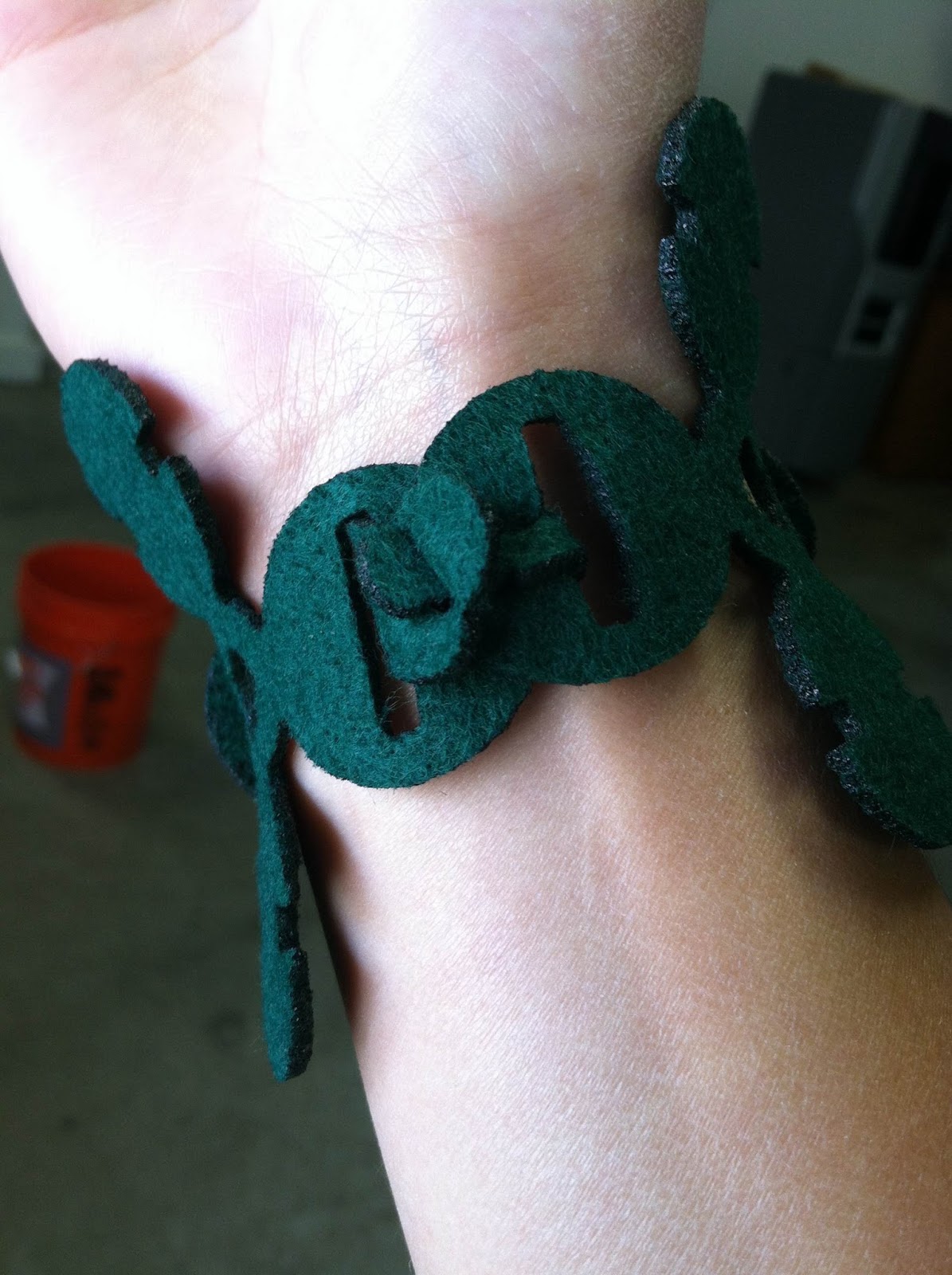
In regard to modeling techniques, I modeled the cetacean tail in Autodesk Maya. I used a cylinder for the base. After deleting the top triangular faces, I extruded the curve several times, scaling it accordingly, and manipulated vertices. Once I was satisfied with the shape of 1/4 of the model, I used the mirror tool to create the form. Then I exported the model as an .obj and imported it to Rhino--where I created a contoured version and prepared it for laser cutting.

For the Keyshot material, I used the light-blue, transparent gemstone material as opposed to a non-transparent colored material. In the coming months, I desire to become more transparent about creating art for therapeutic reasons. All in all, this project was quite liberating. I'm looking forward to expanding upon this theme and creating both meaningful and challenging works of art.


Brittany Jones: 3D Printed Tree House

For my 3D printed object, I wanted to bring one of my virtual beloved 3D models to physical form. For my senior capstone project, I modeled and textured an outer-space themed tree house. The model is now the story-driven centerpiece for my MFA thesis project (visit http://treehouseln.wordpress.com for more information).

I first modeled the tree house in Autodesk Maya. The tree trunk was created using cylinders. I used the extrusion tool, append to polygon tool, and moved/merged vertices a lot throughout the process to create branches. The wall boards were modeled by creating a square shaped panel and using the boolean difference function to make the circular window. The leaves were created by modeling a sphere and manipulating the vertices. Lastly, I imported the model into Rhino and scaled it down to 2.5 inches tall to prepare it for printing.

For the material, I chose a saturated, non-transparent forest green plastic. In a future iteration of this model, I plan to paint the 3D print and add a couple more modeled elements (tree swing using wire and pssibly a 3D printed telescope that I already have designed).