 |
| Ghosted |
Concept
Inspired by Harry Potter novels containing details about Hogwarts castle, I wanted to base off my castle off of a few aspects that appealed to me. To begin with, the towers that seemed to be located in many corners of the castle seemed to create a more surrealistic appeal to draw the line between reality and imagination. However, before adding towers randomly in place, I also needed a basis of where to place each tower. After looking at an image of a simplified,
Lego version of Hogwarts, I was able to notice the general layout of the castle. However, the style that I had desired for my castle was much more simpler that the detailed castle of Hogwarts.
 |
| Layered |
Process
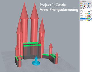
When creating the basis of the castle, I began with the creation of the building bases that were rectangular in shape rather than the actual towers. I wanted to be able to figure out where to place each tower while also maintaining a semblance of symmetry for my castle. When placing the rectangular bases, I had also wanted them to form a semi-circle shape. To do so, I added two smaller rectangular bases on one side and rotated one of them to act like a corner piece. Then I reflected the two small bases to the other side to maintain the symmetrical balance of the castle. After creating the five large, rectangular bases, I wanted to add a bit more detail to the castle. Based off of classic castle designs, I created structures on top of the rectangular bases to give it a more reminiscent effect. After that, I worked on the towers and kept it fairly simple. Using tubes and cones, I created basic tower structures to add more to the castle-like appearance. Since there was negative space in front of the castle, I decided to add a fountain made of truncated tubes, and tori.
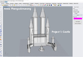 |
| No Naked Edges |
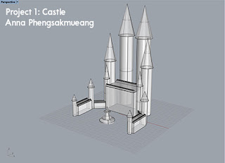
Perspective Shot
Materials
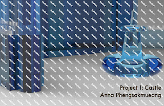
For the appearance of the castle, I chose to go with a variety of blue colors accented with white. To do so, I used sapphire, diamond, and aquamarine for the castle. The sapphire was used for the towers while the aquamarine was used on the bases. In addition to the bases, an accent that helped to add a bit more contrast to the castle was diamond. For the fountain, I chose to use a liquid material that was also blue. The reason I chose blue as the main color for the whole castle, was so that it would appear more unified and that blue is my preferred color of choice.
 |
| Pedestrian Shot |


