Monday, February 4, 2019

Jonathan Holt: Week 1 Castle

Ghosted

Concept: I got my inspiration from a castle I designed for a DnD game and partially from the amount of spikes on the castle in Legend of Zelda (as shown below). It is meant for a lavish and rich evil ruler. He has armies at his command an the authorities on his payroll.
Layered
Techniques: I quickly decided that spikes were the way to go. Everybody loves spikes, so I played around with different heights. At first Most of the spires were on the same level, this made it super bland looking. I added varies sizes to give it a menacing look. This should be the final fight in a campaign and should force the players to be in close quarters with the enemy. I packed the towers close together to give it an overwhelming feeling once inside.I would create one whole tower and copy it to make it even with others. 
Establishing shot

Pedestrian view
Materials: I really wanted to show how rich this enemy was so I stayed away from plastics and wood. I had problems with very reflective surfaces because they made the towers blend into the floor. I went with marble, porcelain, and metal to give it a luxurious feel.


Sunday, February 3, 2019

Anna Phengsakmueang: Project 1 Castle

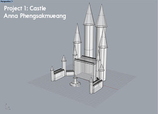
Ghosted


Concept
Inspired by Harry Potter novels containing details about Hogwarts castle, I wanted to base off my castle off of a few aspects that appealed to me. To begin with, the towers that seemed to be located in many corners of the castle seemed to create a more surrealistic appeal to draw the line between reality and imagination. However, before adding towers randomly in place, I also needed a basis of where to place each tower. After looking at an image of a simplified, Lego version of Hogwarts, I was able to notice the general layout of the castle. However, the style that I had desired for my castle was much more simpler that the detailed castle of Hogwarts.
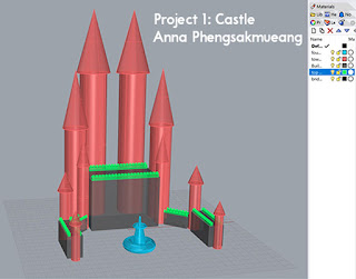
Layered
Process
When creating the basis of the castle, I began with the creation of the building bases that were rectangular in shape rather than the actual towers. I wanted to be able to figure out where to place each tower while also maintaining a semblance of symmetry for my castle. When placing the rectangular bases, I had also wanted them to form a semi-circle shape. To do so, I added two smaller rectangular bases on one side and rotated one of them to act like a corner piece. Then I reflected the two small bases to the other side to maintain the symmetrical balance of the castle. After creating the five large, rectangular bases, I wanted to add a bit more detail to the castle. Based off of classic castle designs, I created structures on top of the rectangular bases to give it a more reminiscent effect. After that, I worked on the towers and kept it fairly simple. Using tubes and cones, I created basic tower structures to add more to the castle-like appearance. Since there was negative space in front of the castle, I decided to add a fountain made of truncated tubes, and tori.
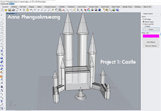
No Naked Edges
Perspective Shot

Materials
For the appearance of the castle, I chose to go with a variety of blue colors accented with white. To do so, I used sapphire, diamond, and aquamarine for the castle. The sapphire was used for the towers while the aquamarine was used on the bases. In addition to the bases, an accent that helped to add a bit more contrast to the castle was diamond. For the fountain, I chose to use a liquid material that was also blue. The reason I chose blue as the main color for the whole castle, was so that it would appear more unified and that blue is my preferred color of choice.
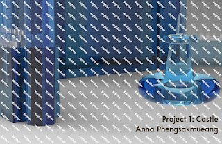
Pedestrian Shot


Justin Chang: Week 1 Castle


CONCEPT:
The concept for my castle came from the various palaces I’ve seen while I was deployed in the middle east. I was always amazed at how the structures were composed of sand-like material. It inspired me to follow along a similar color choice for the exterior surface of my structures.


TECHNIQUES:
When creating my castle, I began with a solid rectangle as my foundation. Then I created a 10-sided polygram within the foundation and extruded it. Same goes for the small building, except I made holes on each side, representing windows and I threw a dome roof on it because it looked odd without it. The outside pillars were done in multiple steps due to the various shapes associated with it. I started with a cylinder and extruded slightly above the foundation. Then I placed a truncated cone on it and began extruding the cylinder again past it. A solid rectangle, rotated about 45 degrees, was placed on the cylinder and once extruded past it. Lastly, a truncated pyramid added as the tip of the pillar. The four smaller cylinder’s placed within the foundation have spheres dropped inside of them that make it look like half a sphere or a cap for the cylinders.


MATERIALS:
During the process of making my castle model, it reminded me of making Lego’s or small-scale car model’s, so I decided to choose a plastic toy like colors. Although, I didn’t choose materials under the plastic section because I didn’t like the high levels of gloss. 

Nikki Chauhan: Week 1 Castle


Ghosted Shot
Concept:
Starting off, I started basing it on one of the sides of the Moszna Castle in Poland which despite its name, is currently a lavish hotel. I enjoyed the tower structure and the relation in the architecture between the rectangular/cube center block, the rectangular area connected to it and the towers attached to that.

Layered Shot

No Naked Edges
Process: As I started thinking of how I wanted to draw out my design and execute it, I began to just imagine it as the same as the picture but more simplistic with maybe a few added details and touches but as I began designing, I realized I wasn't going to be able to make it as my computer died and I had to get a new laptop. As I started from scratch with barely two days to spare, I started with making my rectangular center piece and then connected the large rectangular space behind it. Continuing, I began adding the cube-like area behind one of the towers and then began assembling the tower. Getting to this stage I decided to scrap the whole idea and go with something of my imagination that came from a mixture of ideas. I added outer cylindrical window-like areas to the tower and in the back, a large coned dome like area. This came from the inspiration a mix of the St. Peter's Basilica and the Hagia Sophia except that instead of a dome, I chose to go with a cone shape with the top cut off and placed a sphere in that center.

Bird's Eye

Establishing Shot

Pedestrian Shot

Materials: For the materials, I chose metal for the tower piece and the cone like structure as it is a strong material in reality and has a pleasing aesthetic look as well as a nice durability. The rectangular areas, the ball at the top and the windows on the tower are all glass as a pretty window look to create a stained glass effect.

Jacob Hunwick: Week 1 Castle


Concept:
For my castle I created a chess set and utilized the pieces and the board squares as
modular elements. Chess is originally a war game. Within the game each player has a
preferred opening. An opening is just the first four or five moves in the game, popular
combinations come to have names. On the top of the castle the pieces are arranged in
my favorite opening the Ruy Lopez I see this opening as my castle because it is one that
I play often and feel comfortable with. MC Escher’s work inspired the overall layout
(see escher-reflections, escher-chess).
I wanted to maximize the amount of reflections, and interesting refraction's. I achieved this
first by creating two layers of tiled board, and placing sphere-topped pawns to hold up
each corner.

Techniques:
Chess pieces are created by spinning blocks of wood with a lathe, and carving out curves
as the wood spins at high speeds. The process is similar to pottery, only a lathe is subtractive.
In order to get a lathe-look, I drew out the contour of each piece and revolved it around
its center.

Next, I duplicated and arranged the pieces on a standard 8x8 board. For the additional
elements I duplicated pawns, a rook and knights to hold up the board on top of a larger
platform.

Materials:
Chess sets are traditionally wooden or glass. For my variation I chose white and black
glass for the light and dark pieces respectively. For the board I used black glass and
24 carat gold. The selection was primarily to make interesting reflections as mentioned
in the concept. For the large knights below the smaller board I used a dark wood to make
the large corner pawns stand out. I originally had the knights as glass, but this made the
\reflections very messy and overly complex.

Ryland Smith: Week 1 Castle

Concept: I was curious what can be a castle and I began to ponder on when I loved knights and castles and the nostalgia brought me to childhood. I did, and still do love boats, so I thought a toy castle boat might be my avenue. If a castle means we are fortified in our space to command our garrison, is not a boat a castle? This was my space as I forged my Castle Boat.

Ghosted
Layered
Techniques: I began with the hull and to accomplish this I created a curve and then mirrored it. following I would copy the curves away and then make a surface. Afterward, I proceed to copy that surface 3 more times. creating an end piece from the curves and an extra horizontal line I would cap it at the back. I created a triangle and line up the curves once again creating a surface from the curves. Then I proceed to join the hull. Next, I used torus and rectangular prism solids to form the engine. To create the rutter I used curves and then extruded these curves. The ladder is a boolean joined set of cylinders. The captain deck command center used boolean difference to create the solid. The baluster is created by drawing curves and then rotating it to create a solid, then boolean join a cylinder on top.

Establishing

Pedestrian View
Materials: I used plastic for the hull and engine. Its a toy boat and so decided plastic would make the most sense. The engine is red as the color pops and implies power. Then I used brass on the balusters to add luster to the boat. Then the captain's loft uses anodized aluminum to have more shine. The floor and ceiling use plastic as well but textured adding a bit more variety to add interest. Altogether I chose materials so it feels like a radical cyberpunk toy boat.     
  

Jesus Vela: Week 1 Castle

Ghosted Shot

Concept

     This castle was based off of the Palacio de Bellas Artes in Mexico City. As a concert hall adorned with vibrant windows and a clear stone, the palace is significant as a cultural torch for many Mexicans. I innovated the palace by adding additional towers to the structure while also reducing some details. The materials I used in the rendering of the images gives my castle an equally vibrant personality, making my castle an adequate residence for the Muses.

Layered
No Naked Edges

Techniques

     Throughout modeling, the gridsnap aid made it easy to arrange solids into the castle. When constructing the castle I first laid out a polyline around the castle's perimeter. Next I used the box tool to construct the main frame layer. The rest of the layers include more boxes (Entrance and Roof), paraboloids (Pillars, BigTowers, and SmallTowers), and extruded triangle and arc/half-circle surfaces (Roof and Windows). When running the naked edges diagnostic, all of the pillars and tall/small towers had naked edges. Since paraboloids are not originally closed solids, I employed to solutions to get rid of naked edges. First, the pillars which are composed of mirrored paraboloids were joined into a single solid. Second, The tall/small towers to closed using the cap command. All in all, layers simplified troubleshooting by allowing me to address issues in chunks.

Opening Shot


Materials

     The Palacio de Bellas Artes was built in an art Art Nouveau and Art Deco (Wikipedia). To reflect a similar importance in decoration through linework, materials and lighting were important to convey the aesthetic theme of the castle. Materials used in Keyshot for rendering the castle include: Anodized Aluminum, Ginger Bronze, Glass Red, Gold Polished, Soap Bubble, and Tiles Hexagon Dark Grey. The latter material worked perfectly as the ground layer because it accents the symmetrical character of the castle. While the metal pillars help define the glossy main frame, the metallic towers and entrances add volume to the structure. Soup Bubble material is very glossy and without edges, so brightness and contrast were increased to help distinguish the curves around the castle. Soup Bubble material was very exciting to work with, as color was manipulated when capturing shots inside as well as outside the castle.

Exterior Pedestrian View
Interior Pedestrian View