Showing posts with label Assignment 1. Show all posts

Monday, September 18, 2017

Conrad, Michael: Castle Fall 2017

concept
I appreciate the roundness of the features of Antoni Gaudi.  Ultra modern simplicity was imbribed into the sculptural space that could serve as an expansive living space.
Image result for antoni gaudi works

technique
Using the polyline tool, I lofted a wall structure to make a facade.  Then, I incorporated a central space that could serve as a courtyard.  I added a slanted partition to the larger of the vessel rooms.  There are two paraboloids on the surface to offset the loneliness of the ingoing cylinder and to serve as decorative elements.


material
Urban concrete texture best matched the theme of the concept because of its rigidity and absoluteness of form.  

Sunday, September 17, 2017

Matthew Durham: Castle Fall 2017

Concept
      My initial idea came from a mixture of ancient Greek origins and art from Disney's Hercules and God of Wars mount Olympus. I wanted the design to have similar elements however while at the same time the throne being its own separate entity. 

Techniques: 
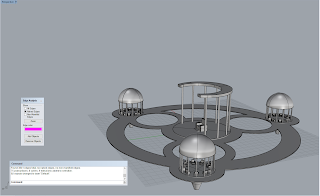
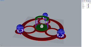
     All my design where based on a circular shape which where just repeated among the castle. For all bases of the circular pavilions I used a cylinder with truncated cones attached to the bottom to give it the tapered look. The throne is made of rectangles that are combined to give it, it's shape. That was then copied and scaled smaller to make the chairs for the smaller pavilions. once I had both the throne pavilion and the smaller circular made I brought out the smaller pavilion and did a polar array and used that to make the other two. After everything was correct I used the circular tool to make the circles, which where then used with the Curve Boolean to make the circle shapes. 

Materials:


    For colors I wanted to stick with materials that where warm inviting and peaceful. For materials I selected granite for the pavilions to give it the feel of everlasting, like it was built to last. The pillars I used porcelain for the fragility of such belief as well. The throne and chairs where made of marble for the same reason as the pavilions. 

Valeria Cavazos: Castle Fall 2017


Concept:

                  The concept for my castle was to create a sandcastle on the beach and using objects that could be found scattered in the sand. The design for the castle was also created to fit a king, in this case a small crab, the King Crab. There was a general idea of how to make the castle but details were added and created as the castle was created, such as the glass pieces and the drawbridge.

Techniques:
ghosted image
ghosted image
ghosted image with Keyshot layer assignment

                  The sandcastle was created using mostly rectangles and flattened circles, such as the base and the main structure of the castle. Sitting on the center of the castle was created using the truncated cone tool along with the small details bordering the castle, alternating from the truncated cone and a regular cone, then copied and pasted an entire row of the alternating cones and pasted on the remaining three sides of the castle. I made the windows of the castle through the MakeHole command and curve tool, made the draw bridge using the cylinder and torus tool, and the scattered glass pieces placed onto the walls of the castle was created using the line tool and scaling it to an appropriate size for the walls. I made the crab statue by using the sphere tool, copy and pasting and scaling it until the claws and eyes were appropriate sizes to the body, then added small cones to represent claws. Once the main details were placed, I added scattered truncated pyramids around the castle to create small mounds of sand and made two triangle pieces on either side of castle, using the triangle tool and twist command to create a deformed shape to represent a shard of a bottles neck.

Materials:


                  I wanted to create a sandcastle with the objects found on the beach but some materials were not available in Keyshot, so some changes had the be made. There was no sand material available so the actual sandcastle illusion had to be made with, disturbingly, human skin material. The glass pieces placed around the castle were created with basic glass colors such as red, orange, and clear to create a variety in the pieces, while the two giant glass pieces used a scratched and waved glass material. The draw bridge used a variety of wood materials, such as ash wood and old plank wood, in order to keep the theme of items that can be found throughout the beach. The flat circular objects on the pillars of the castle were originally going to be sand dollars but there was no materials that could be used as a replacement, so they became miscellaneous objects such as using the bubble material and rose gold material. The giant crab sitting in the center of the castle was going to be an actual crab but while playing with the metals to find a material, I came across the rusted metal material and decided that it would be best to have a statue in honor of the king that has been worn down over time from the sea.

Thursday, September 14, 2017

Anyssa Akridge : Castle Fall 2017

Concept
My concept for my castle was to create a cat scratch temple. I based my design off of cat scratch posts because its supposed to be like a sacred area of enjoyment and worship for cats.. The cat model in the middle is a statue for the cats to worship.

Techniques


The modeling techniques is used for this project was the line tool, extrude closed planar curve, copy and paste, nurbs modeling, cylinder tools, box, make hole, tube tool and the torus tool. To create all the flat cat statues I first drew out the outline of the cats with the line tool then I used extrude closed planar curve.I made the cat platforms and pillars using the box, cylinder, tube and torus tools. I made all the holes by drawing out the shape using the line tool and placing it over the object I want to use make hole on. I made the nurbs cat model by first making a sphere, adding more points on the sphere, and moving the dots around to create a cat like shape. I did the same for the paws.

Materials


I wanted the castle to feel royal high class and elegant, so I used expensive materials to show that. I used a 24k brushed gold texture on the huge cats behind the temple as well as the pads on the paws and the object holding the cat model up. I used a purple jewel like material on all the cats and the paws. This is because the cats are objects of worship so they're decked out in wealthy materials to show their importance. Black marble is used on all the pillars and granite is used on the platforms. Black glass is used on the biggest cat shaped platform with a shinier car paint material platform underneath it and the huge gold cats. Then I used a ruby jewel material on the cat tubes. I tried to keep the pallet purple and gold as those colors were the colors of the rich in olden times.

Friday, September 9, 2016

Brandon Wehenkel: Castle


 Black & White Ghosted

Colored Ghosted

Different Angles

Concept:
"Your home is your castle, but it is also your identity" ~ David Soul
This design is far from the medieval interpretation of castle, but its the idea that your home is your castle that I went with.  I enjoy the intricate designs of modern homes especially the ones that defy logic and dangle over the sides of cliffs. Also I played The Sims a lot and I like creating modern homes more often.  A particular youtuber from Australia is my inspiration for most of my home designs.  I chose to create a home where the center is water and everything around it builds up and down from that.

3/4 Aerial

Entry-way Interior

Modeling Techniques
:
There are 365 pieces in this house and most of them were created with ExtrudeCrv and Copy.
The main level is not the level is not the foundation.  That is found on the lowest level that dangles over the cliff side.  The main level is where the pool rests (red layer in colored ghosted photos).  I built the house entirely around the pool allowing stairs to move above and below the pool.  When I created this model I didn't know about the 3D/2D scale tool.  So I used all four perspectives to measure out each block repeating them many times due to the size being wrong. In the ghosted mode, everything is colored according to floor and wall, except glass and the pool.
On the curved shapes, where the drive way is, I used Polyline and changed it from line to arc in properties. Then used Cap planar holes.  I used the Polyline tool several times to create triangular blocks around the architecture.

POV Back
Materials:
Most of the modern homes look like they're just giant blocks of colored cement.  So I chose white Carrara marble due to its similar quality, then changed its roughness.  I added the glass materials to the areas where glass should be.  I didn't want people falling over the sides of the balconies, or just walking through the rooms as if they didn't have walls.  The deck around the pool has Mahogany wood material.  Also I felt that the building was too boring if it was all white, so I added some pale green Travertine stone material, a brown Granite material, and some Metallic blue dividers on the main level. I changed the roughness of the white, green, and brown stone to reduce reflectivity.
I rendered with Caustic on to simulate the water effects.


POV Front
Problems:
  1. My main problem with the techniques I chose could have been less time consuming if I knew a bit more about the tools themselves.  I did a lot of trial and error, creating several odd shapes, which ended up wasting a lot of time trying to close them.  I had an idea, but the cap tool stopped working, and I had to redesign the façade.  
  2. The driveway is a bit odd and that is because I couldn't figure out how to blend the roads together. If I knew how to model a cliff it would have looked a bit more ideal.  
  3. Sometime when I imported the document the textures stopped working correctly.  All the textures for the materials became flat and I couldn't revert them back.  So the granite just looks like flat paint on the walls.  
  4. I'm also used to building homes in a game so the whole idea of building in Rhino threw me off, and the overall multi layered layout became a bit overwhelming at times.

Sunday, February 1, 2015

Charles Person: Week 3: Duck

I went through several ideas for this project thematically, from a mulitheaded duck to a cyborg duck, but I eventually decided I wanted to go for two simple aspects. A big soft children's toy that can be thrown or hit, and a general steamboat theme for no greater reason honestly than it occurred to me. The black and white color scheme grew out of the steamboat concept as it made me think of classic cartoons.

On the modelling end the duck itself was a simple matter, mostly made following the tutorial posted. The wheels were made mostly through subtracting and subsequently adding squares from and to a cylinder, with additional boolean difference subtracting to smooth out the model. Finally the smokestacks were a combination of multiple cylinders and tapered cones with one long cylinder subtracted from the center.

For textures I wanted to evoke something soft and flexible, so I chose rubber for the wheels and a soft white plastic for the main body.  The smokestack's more glossy plastic is meant to show that those parts would still be molded in one piece with the main duck body, but would be painted over to make them black. The rubber wheels also provides the added bonus of giving additional traction to the duck and helping it stand in the real world.

 Ghosted
 Ghosted with layers
 Render front
Render rear

Charles Person: Week 3: Flashlight

For this project I wanted to go in the direction of a kids toy more than an industrial or commercial flashlight. I had a vague memory of a flashlight that did this puppet show effect and wanted to attempt something like that. The ability to turn the mask so it's not in the way of the light and the jack o' lantern theme were ideas I developed while working on it.

The base flashlight casing was created with basic boolean functions following the tutorial. for the face on the front I used lines, drawing half a face, then mirroring it and extending the solid out from there. For the connection between the face and flashlight I created a simple cylinder with half sphere indents subtracted from the sides, with corresponding half sphere bumps on the flashlight casing.

For the materials I wanted to continue the theme of this being a kids toy, so I went with bright colors topical to Halloween. The translucent orange and green were chosen to evoke a jack o' lantern, with the green made of a softer material to help with gripping it. The hard purple plastic on the face was chosen to make it seem less breakable while staying with the overall Halloween color scheme.

 Ghosted
 Ghosted with layers
 Front render
Rear render

Charles Person: Week 3: Castle

 For the castle I decided I wanted to take it in a slightly less fortification direction and more of a haunted house feel. I've always liked the idea of clearly mismatched things pushed together, in this case the stone watchtower and dilapidated old house. One particular inspiration for the house itself was the titular mansion from the game Luigi's Mansion, which primarily contributed the slightly tapered lines of the house.

The model was mainly created through uniting and subtracting from simple boolean shapes. I used the taper tool to give the house a subtle effect of caving in on itself by having all the edges curve inward. The stones on top of the tower's rim were actually placed and rotated by hand as I wasn't sure of using the tool that does that manually, something I'll have to work with more in the future.

For the materials I primarily wanted older, rougher looking woods and some kind of simple stone for the tower and walls. In addition to this I wanted some kind of tarnished metal for the spikes on the wall, though I probably should have found a more tarnished and rusted looking metal. In retrospect I tiled the stone parts too much in an attempt to make the overall model look large.
 Ghosted

 Ghosted with layers

  
 Bird's eye render
Perspective render

Sunday, September 7, 2014

Sowmya Rajendran: Project 1: Form

___________________________________________________________
Week 1:

I’ve always been interested in figure studies, so I decided to translate one of my old figure drawings into a 3-D model. I wanted to explore the organic forms and beautiful S-curves of the human form – especially focusing on the line of action of the figure. First, I looked at some of my old figure drawings for reference.


French artist Gaston Lachaise perfectly juxtaposes a solid, weighted form with  fluid  gestures giving the piece, aptly titled "Floating Figure", a weightless and serene quality. 

I really loved the curves of the second gesture drawing, so I decided to build something similar, but with a little more exaggeration. In Maya, I started with a cube and used the extrude and edge loop tool to build the torso and bottom half of the figure.


I continued extruding quite a bit more to build the rest of the areas, and I also used a very handy tool called the sculpt geometry tool to soften the edges, which resulted in a smoother form.  I wanted the form to be asymmetrical in nature, in order to capture the movement of the gesture drawings, but create balance at the same time; so, I pulled the left arm out, and I pushed the hips on the other side out a little as well. 

And here's the final design!
___________________________________________________________
Week 2:

For this week, I decided to fix some areas of my model (the figure felt too stiff). First, I separated the legs and positioned one leg in front of the other to give the figure more movement. After hearing some feedback from a fellow classmate, I also brought down the chest area a tad bit and rotated the torso to exaggerate the pose even more. 

New and Improved Model
No naked edges found. Off to printing!

___________________________________________________________
Week 3:

I uploaded my model to Shapeways and it passed the initial tests. The material I chose was white strong & flexible plastic. Shapeways sent me an e-mail a day later letting me know that my model had passed the manual test, and it was ready to be printed out. I'm pretty excited to see how it will turn out! 

I found hollowing out your model can save you a ton of money. If anyone is interested there's also a 10% discount for students and the promo code for that is C65GX.


___________________________________________________________
Week 4:

I really loved the weathered texture of the Floating Figure sculpture (pictured above), so I applied the Steel Ultra Scratched material in black to my sculpture to replicate the same look and feel of Lachaise's sculpture. The lighting environment I used was 3 point Sharp Low 2k.


___________________________________________________________
Week 6:

Here is the final printed model I received from Shapeways. 


___________________________________________________________