Wednesday, September 28, 2022

Bailey McCalla: Project 2-Part 2-Tail


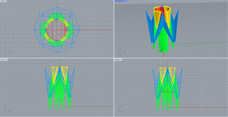
Orthographic View
Orthographic View

Perspective View


Perspective View- Naked Edges

Could not figure out how to solve naked edge problem, I require further assistance.

Monday, September 26, 2022

Mayah Delagarza - Project 2 - Part 2 - Pins

 Update Design

     Did a redesign giving it my own original flair and style to the symbols. Instead of doing the whole hair clip, I will just be doing 2 different designs that can be put onto 2 different pins. 

Updated Designs


Rhino Images
   

    Spent hours trying to get rid of the naked edges, but every time I did I would just either make more or create harder ones to fix. I will be fixing in class this morning using the professor's help and advice.

Ghosted Image Rhino


Naked Image Rhino

Orthographic Image Rhino

(Update: Updated the purple flame model so that the circle in the middle is smaller and does not cause the fillet edges and extrusions to not be able to unionize correctly.)


Fixed Naked Edges Model


Sunday, September 25, 2022

Brendan Young- Project 2 Part 2

Martin Canales: Project 2 Part 2

 Inspiration (Updated)

Originally, my idea is to make a whole Shrek ears hat. I loved the Shrek movies and wanted to make part of a Shrek costume focus on its ears. I was inspired by the Mickey Mouse hats found in Disney theme parks and wanted my 3D model to base it off that. A few issues stem from that concept, however.

Concept (Updated)

The main issue with the original idea was that 3D printing an entire hat would be expensive. So I had to change the design up a bit to make it more affordable to physically print. Instead of 3D Modelling the entire hat, I decided to model and print just the ears. And to actually make it into a hat, I plan to buy a plain white hat from a secondary source (department store or online), cut the bill of the hat, paint it green (with brown spots), and super glue the ears into the hat. Here's the updated concept in Photoshop.


Model

The 3D Model is made out of two shapes: a cylinder and a parabola. Both work together to resemble Shrek's ears. For the second one, I used the mirror tool to flip the model so I don't have to recreate the shapes and end up messing up the proportions for the ears. A naked edge is left open for the resemblance to be more clear with Shrek.


An Nguyen: Project 2 - Part 2

 Inspiration (Updated)

My original 3D model was a mask inspired by the movie Cruella live-action. However, professor Marder told me that 3D printing a whole mask will be very expensive. Therefore, I decided to make a Cruella pin so I could attach it to my mask which I will buy and customize it separately. 

How the pin would be attached on the mask


Orthography of the pin


3D Modeling in Rhino

Rhino Perspective Black Ghosted


Rhino Perspective Black Ghosted

Rhino Naked Edges


Composition of Orthography and Perspective in Rhino

Rhino Perspective for Keyshot


Helena Silva: Week 5 Witch Necklace.

Inspiration/Concept:
    I love the whole idea of witches and wizards. It is a traditional and common Halloween theme. I would like to incorporate a necklace into my costume as I plan to paint it to give it an old and heavy feeling in the final stage. The biggest factor for why these references and these ideas inspired my overall design is because there are so many types of witches that fascinate me. There are some that are based off the elements or conjuring of spirits. For this project, my concept is to create a necklace that is based on a witch that thrives in autumn that is also focused on lunar energy. This type of which could be presented in the color and texture of wood for autumn. The other part of the necklace could be white or gray to represent the moon. I do have ideas to create a wand and a little wearable witch hat. However, I do want to keep it simple and easy as this would be a longer, and time-consuming process if added-on. Although, if the items were being designed and printed the wand would be entirely made of wood with silver or gold. The hat would be the size of a regular party hat to make it easier to print. I would also create a separate piece like a cloth to go around the hat.  


References

Final Design


Process:
    During my process, I used several tools to create my model. First to create the body, I used the Revolve tool. This allowed for an equal and even flat circular surface. This would also be done with the middle circle that allows the necklace through the item. Then, I would continue to use the Extract Isocurve tool for that middle circle too. Also, I use the same tool for the autumn sign in the middle of the piece too. Next, I would use the Mirror tool for the moons and autumn sign to create a symmetrical look. Fourthly, the Chamfer tool would be used only in the inner front the pendant to give the item a feeling depth. Lastly, I also use Boolean Union and Boolean Split for the final stage.

Perspective-Ghosted

Perspective-Edge Analysis

Orthographic with Perspective view

Materials:
    The materials used in Keyshot is wood for the outer rim of the pendant, inner circle and the autumn sign. The inner plate is a silver metal piece to give it a sheen look but sturdiness too. The choice of lighting was to create a calming feel but the environment used in the Keyshot images was a plain grey background to get a better understanding of the wood texture and metal. I really liked the aesthetic of the final output because the images give the idea of a custom and handcrafted feel.

As Worn

Orthographic View

Close-Ups

3D-Print Close-Ups

3D-Print Worn

3D-Print Orthographic


LynZhang_ToothlessCostume_Part2


Thursday, September 22, 2022

Brock Fuller: Week 1 - 4 Castle

 Reference Image:


1994 Fisher Price Great Adventures Castle


Inspiration:

        When I was little, my parents got me a medieval castle playset. My inspiration comes from this childhood toy: the 1994 Fisher Price Great Adventures Castle. To me, it encompasses everything a traditional castle should have: grey walls made of stone slabs, towers topped by parapets, a dungeon, and even a moat and drawbridge. I wanted to include all of these signature features in my model and arrange them in a layout that is unique from, while also in reference to, my source material. Unfortunately, the moat was cut from the plan fairly early on.


Ghosted (B&W)

Ghosted (Color)

Front view (Shaded)

Top view (Shaded)

Textured model

Ground level (Textured)

Realized Image


Techniques:

        Most of my model was made from inserting and adjusting simple primitives into the shapes you see. There were however several instances in which I drafted elements from planar shapes extruded from curves that I had plotted. The opening for the main entryway is one such example; created from drawing and joining the extrusions of two separate closed curves. In fact, every opening shown was made in such a way.


Materials:

        Most of the castle is constructed from various types of stone and brick. There is also terracotta accenting along the base and parapet of each tower, a wooden frame for each window, and a metallic grate leading to the dungeon. While I didn't want to deviate too far from the colors used in the Fisher Price castle, I did include a small variation of color and texture in a few of the accenting features to offer a more diverse set of materials. Although my goal was to maintain an gritty, "earthy," appearance, in retrospect, I think it would have been much more interesting with even more colorful features like bright red banners or flags. A wider variety of objects featuring textures other than just stone - perhaps thatch or weave - might have helped to reduce the "flatness" of the model.

Wednesday, September 21, 2022

Christine Omo-Amadasun: Week 7 Adornment


Reference Photo:


Inspiration:


As a huge fan of brooches, I decided to base my brooch design of a butterfly since my favorite insect to learn more about growing up are butterflies. At first, I wanted to a mask but decided not to go with the original plan and instead opted for something smaller in scale, hence why I chose to design a brooch instead. For my butterfly's design, I want the coloring for the butterfly to be simplistic but at the same time, contemporary. With that in mind, I decided to go with cool colors like blue and purple to make my butterfly brooch stand out with a little hint of shade to give it that shine and awe.


Sketches:


Commands: Mirror- for the butterfly wings
                     Gumball
                     Rotate 
                     Chamfer Edges
                     Ellipsoid: Form Center ( for the body)
                     Revolve (for the wings)
                     Polyline (along with revolve) 
                     Osnap


Butterfly Brooch Ghosted Screenshots:


                                                         Ghosted: Naked Edges 


                                                 Orthographic Design-Ghosted w/th Layers


                                                                Ghosted with Layers


 Process 

First, I used ellipsoid center for the butterfly's body. Then, I used revolve and polyline for the wings to make it close to an actual butterfly's wings. I originally wanted to use array for the butterfly wings but decided not to due to fear of making the wings too bulky and off-putting.  Later on, I used chamfer edge and polyline again for the wings along with the revolve setting to build in the 3d aspect of the project. I later used mirror for both the wings to better the symmetry of a natural butterfly. For a personal touch, I used revolve and mirrored it, as mentioned before. For the layers, I wanted to use different shades of blue and green to the brooch stand out while also adding some natural and cool colors. As stated before, the ellipsoid center was the foundation of the butterfly, the revolve/array and chamfer edge were for the butterfly's wings, the mirror were there to create the perfect symmetry for the brooch.  


                                                                    Keyshot-Worn


Keyshot- Orthographic Shots


Close Up (1)


Close Up (2)


Materials


Unfortunately due to my other condiments and personal issues, I didn't have time to post-process my design. But if I had the time to print my design, it would have looked pretty good for my first time printing a 3d model.  But with the little time I had due to other projects,  I couldn't finish the whole project. Beside that, I wanted to make my brooch look authentic but at the same time I wanted it to look beautiful. The color scheme that I used for my butterfly represent imagination, inspiration, liveliness, and tranquility while the butterfly itself symbolizes change and transformation hence why I chode to a butterfly brooch for my project.